
UX/UI Design | Conceptual Project | 2 Week Sprint | Solo Project | August 2023
Brief:
Pet shop in Peckham since 1993. They want to upgrade their E-Commerce website but still show that they are
focused on customer service and quality of products.
My Role:
UX Designer, UI Designer, Information Architect
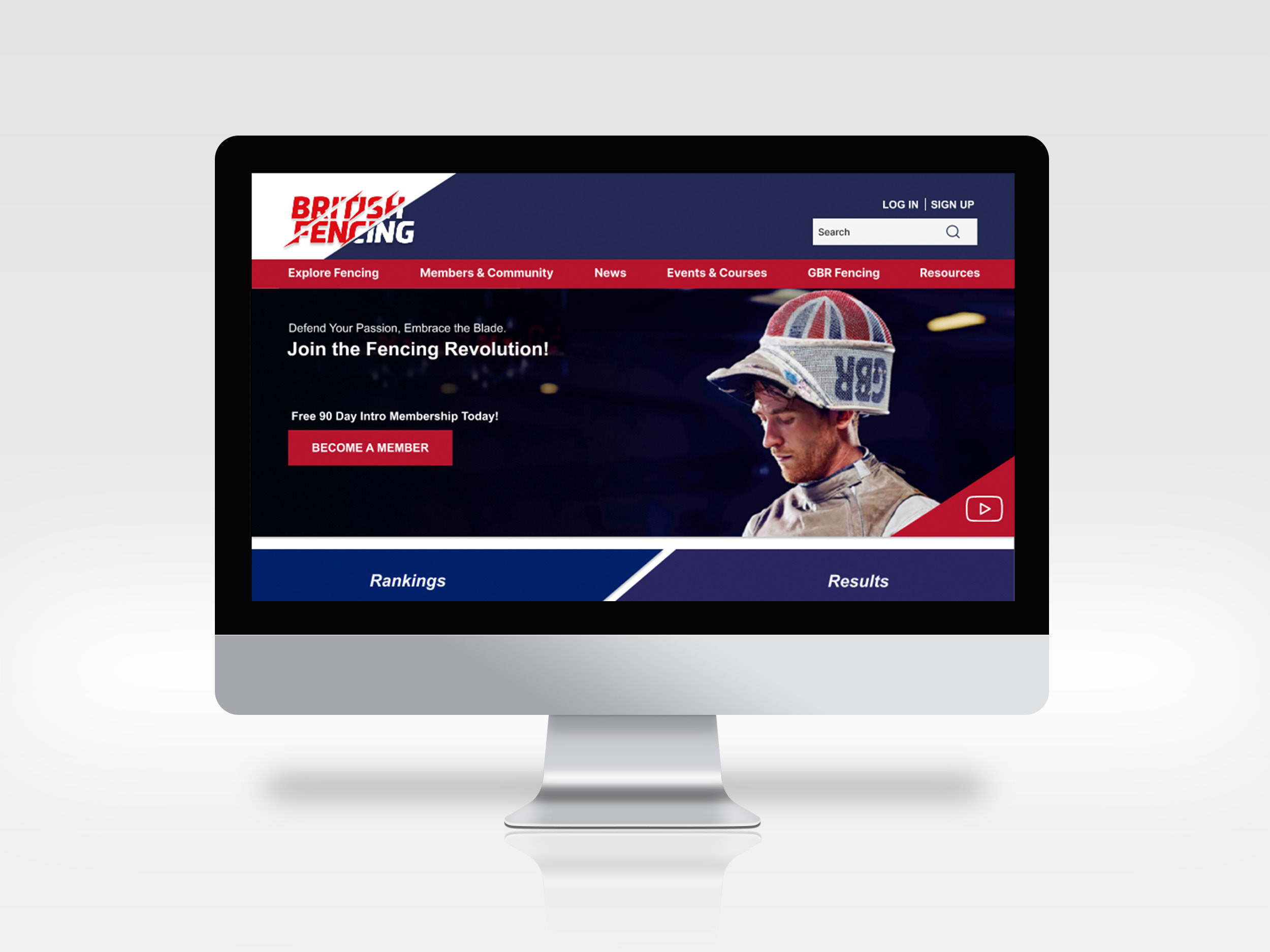
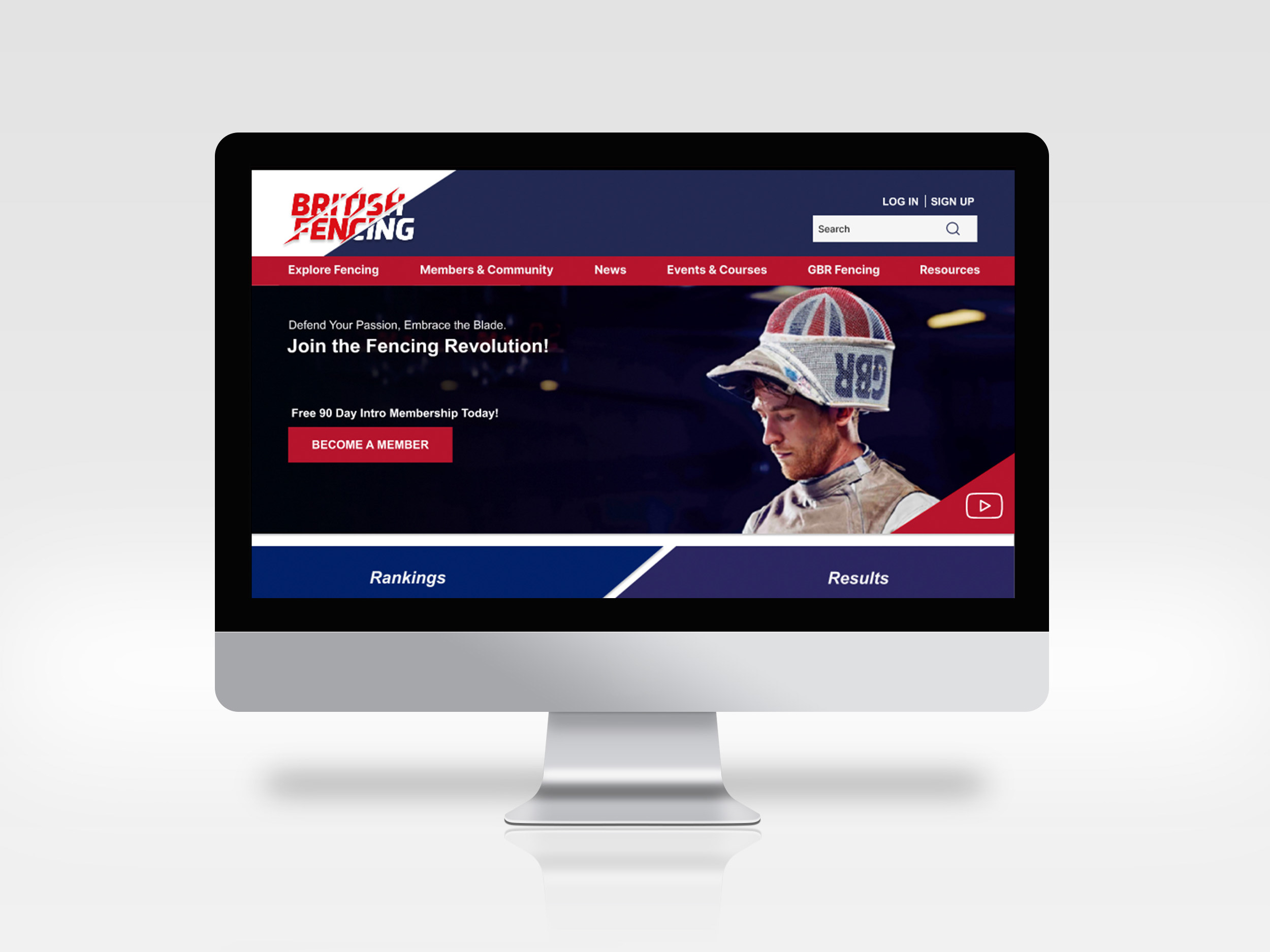
Competitive Analysis:
This was a conceptual project, so there was no website to audit before starting, so I decided to look at who would have been the competitors for 'The Pet Stop'. I picked 2 companies, one was a big chain 'Pets at Home' and the other a small boutique called 'Paws Boutique'.
I started by doing a Task Analysis on both websites' checkout process. Paws boutique had a much simpler checkout process whereas there were more steps involved in Pets at Home'.
I also did a Pluses and Deltas for both websites and here you can see the results from my findings:
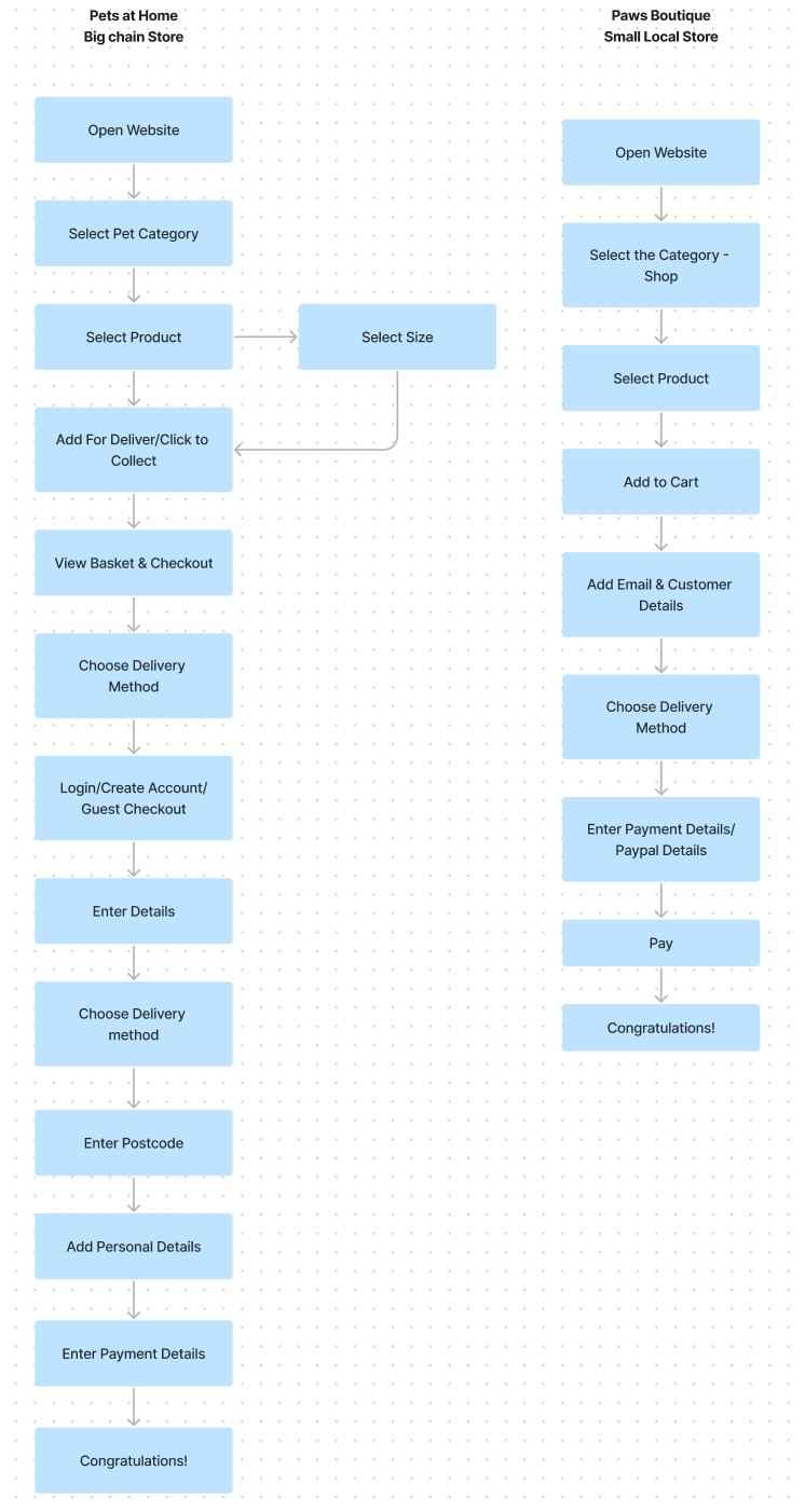
Task Analysis
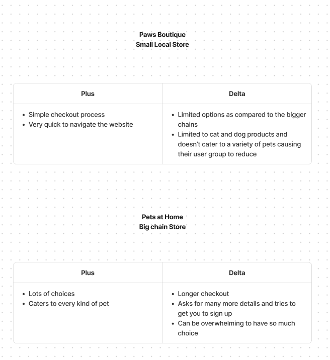
Pluses and Deltas
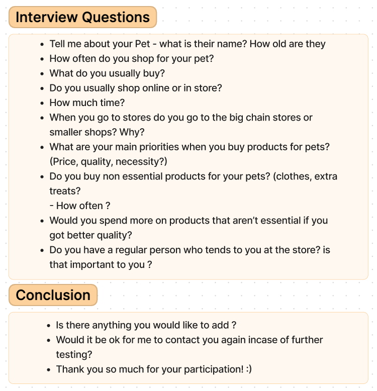
User Interviews:
I created a screener survey on google forms and sent it out online. Screener surveys are a number of questions sent out to potential users to determine whether they would be good candidates for interviews. Interviews are a great way to get detailed and useful information from users. I conducted 6 interviews bases on a discussion guide that I had created:
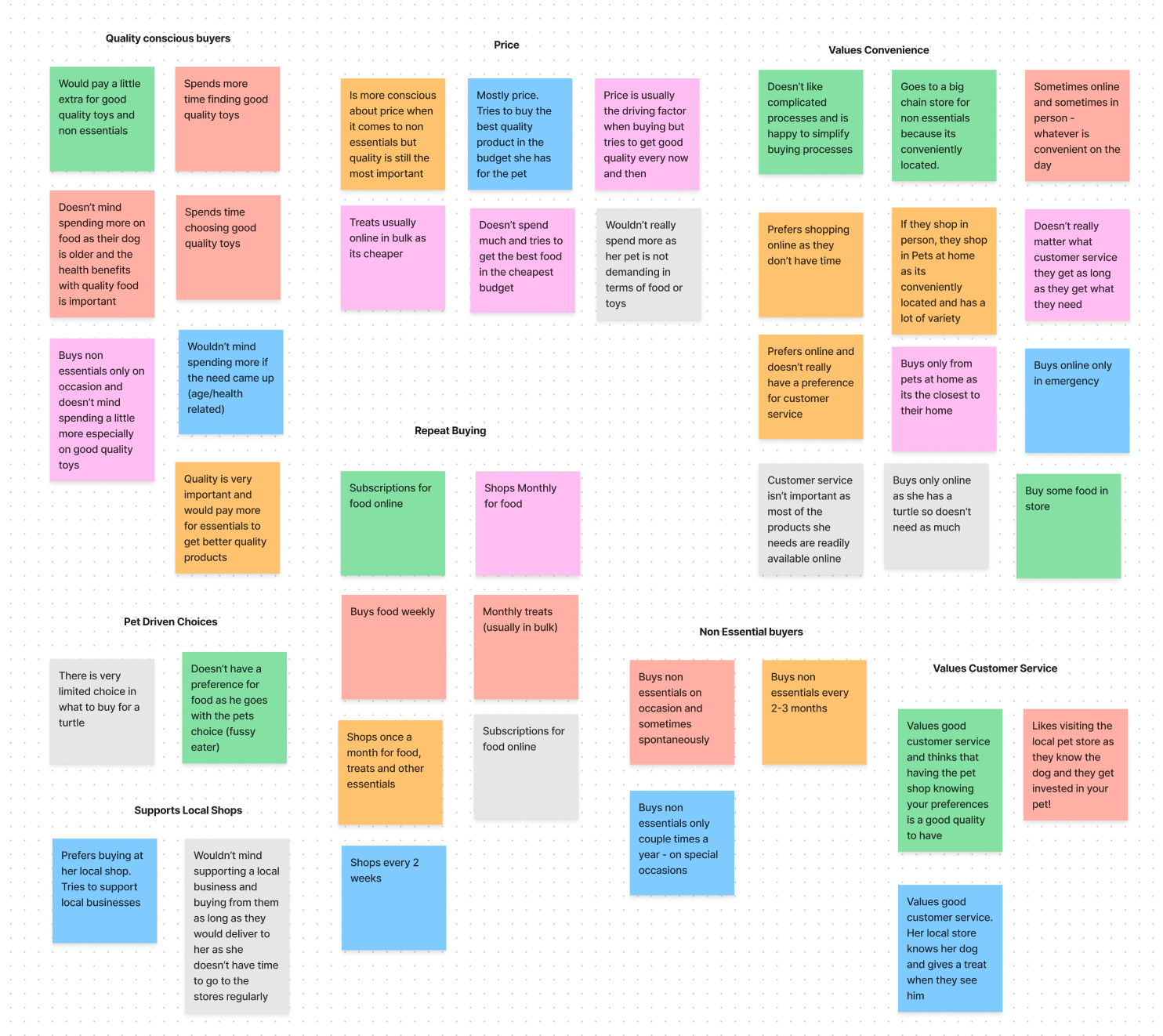
Affinity Mapping:
I used the results from the interviews that I had and created an affinity map with the results. An affinity map is a chart made to organise and categorise large amounts of qualitative data, such as user insights or ideas, into distinct themes or patterns. It helps us make sense of complex information and identify key trends or commonalities seen during the interviews.
The main insights from the interviews were:
- Users seemed happy to pay for quality
of food and products for their pets to be
better.
- Most users see their pet to be part of their family and treat them that way.
- Users live in a world thats fast paced and value convenience of buying online and getting the quality they want.
- Most users see their pet to be part of their family and treat them that way.
- Users live in a world thats fast paced and value convenience of buying online and getting the quality they want.
Here is the affinity map made with the results from my interviews:
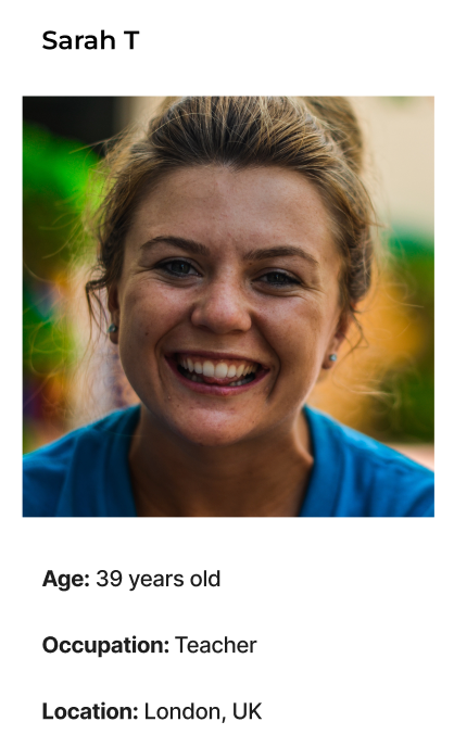
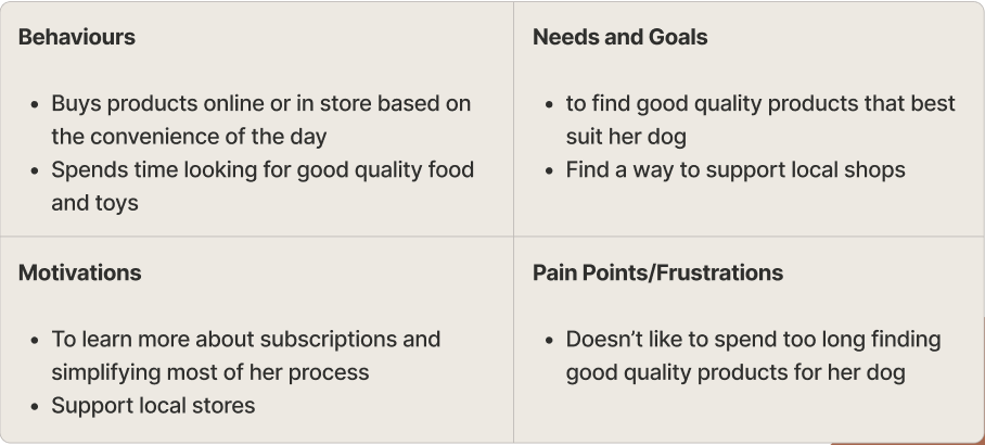
Persona:
Using the information at hand, I created a persona based on all the research:
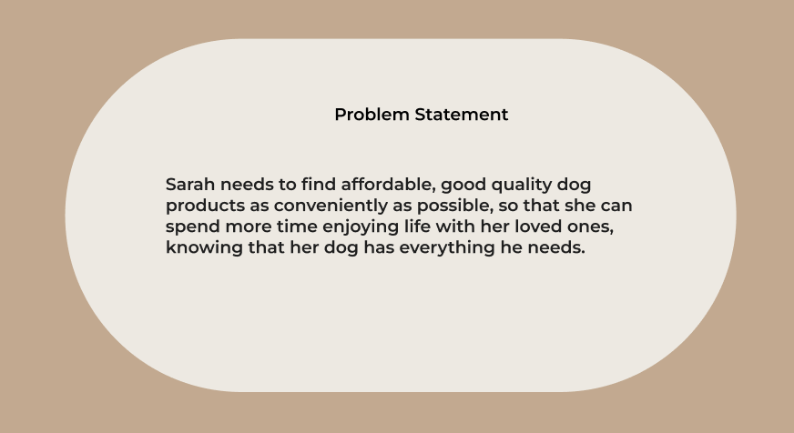
Problem Statement:
I created multiple problem statements but then condensed them into one that seemed to be relevant to the problem faced by the users:
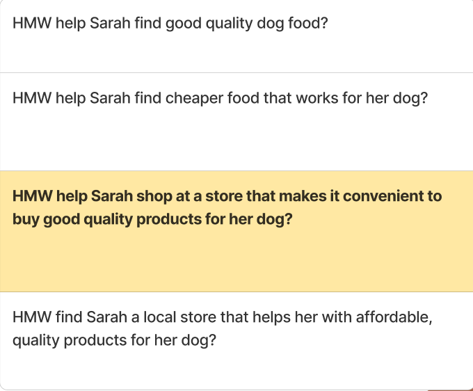
How Might We?
Once I had a strong problem statement, I brainstormed multiple ways of How Might We help Sarah. I narrowed it down to the one that seemed to be the most relevant based on her pain points.
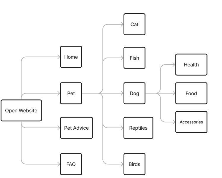
Information Architecture:
Card Sorting:
I had a whole list of items that needed sorting into different categories. I set up an open card sort on OptimalSort. I kept it open to see how different people would categorise items.
Key insights from my card sorting and brainstorming to create the architecture of the website were:
- Users prefer to group all
products under a specific pet
category instead of in a
separate category (E.g. Antlers
under dog instead of accessories).
- Primary Navigation titles to include Home, Pet, Pet Advice.
- Secondary Navigation - titles of pets.
- Faceted Navigation - Health, Food, Accessories to further filter products
- Supplementary Navigation - to be added in a bar at the bottom of the screen to provide options such as ‘contact us’.
- Primary Navigation titles to include Home, Pet, Pet Advice.
- Secondary Navigation - titles of pets.
- Faceted Navigation - Health, Food, Accessories to further filter products
- Supplementary Navigation - to be added in a bar at the bottom of the screen to provide options such as ‘contact us’.
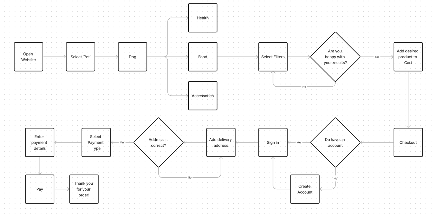
User Flow:
After creating the architecture for the website, I thought about how a user would get from opening the website through the checkout process. My focus was to keep this as simple as possible. Creating a user flow is really helpful for me before I start sketching screens as it gives a clear path of what to sketch and how to get to the end in the smoothest and most efficient path.
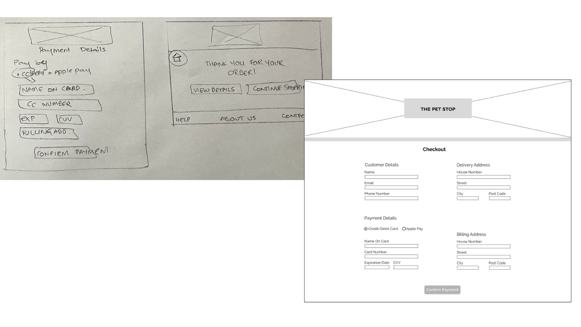
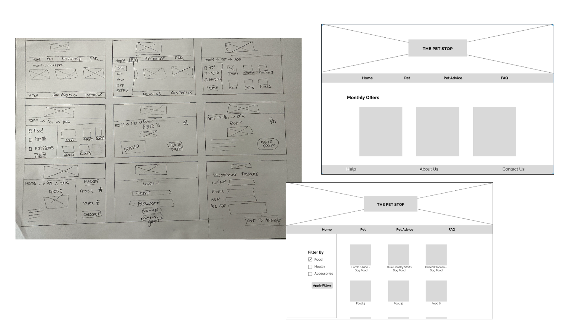
Low/Mid Fidelity Wireframes:
Once I had a user flow, I started sketching screens based on the flow to create low/mid fidelity wireframes.
Here you can see the evolution of my wireframes from sketches to low/mid fidelity. I wanted to keep it really simple so that it was inclusive to users who were not as comfortable with using websites but wanted to buy products for their pets online as well. My goal was to keep it clear and simple but providing all the options available on the website.
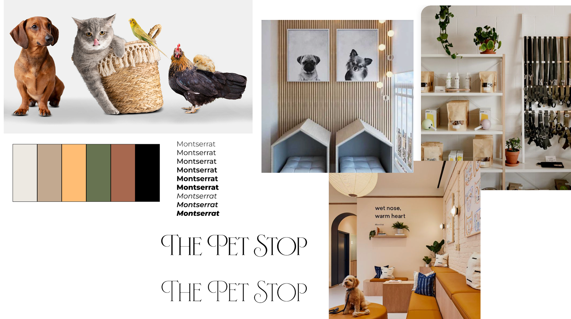
Style Guide:
Before I started planning my High Fidelity Wireframes, I started to search for inspiration and created a moodboard to get the feel of what the store for the 'The Pet Stop' would have looked like and what the general feel of the website should be. I went for warm, muted earth tones and I wanted the website to have a welcoming warmth when a user arrived. I collected pictures of different themes and created a colour palette that I would like to use on the final website. I chose a font which had many styles and was clear to read to make it accessible for all users.
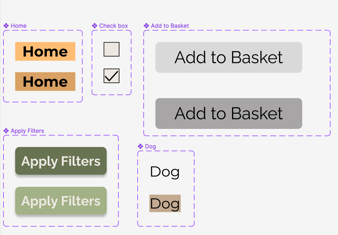
I also created components with buttons, checkboxes and highlighted text that can be used universally throughout the website.
Usability Testing:
Usability Testing is a way to test whether the prototypes are working for the users. If something is not working, it is a good time to make changes going forward. For this project, I used moderated user testing, giving the users two tasks to perform and then taking feedback from the users regarding their experience using the prototype.
The two tasks were:
1. Look for Chicken & Vegetable Dog Food
2. Check out
Both tasks were done under two minutes, highlighting the simplicity of the process.
All tasks were carried out successfully and did not require any intervention from me
Key Insights from Usability Testing:
- After checkout there was no confirmation number or receipt.
- The fields in the form were small and difficult to read.
- The fields in the form were small and difficult to read.
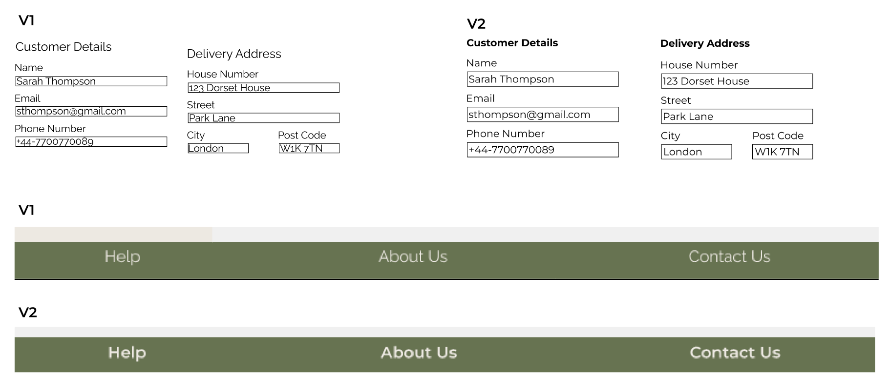
Iterations:
After evaluating the results from the usability testing, I made some changes.
- I added the confirmation number when the checkout was complete
- Increased the size of the entry fields in the form to make it easier for users to read the information they had filled out better than they could.
- Increased the weight in the footer bar to increase contrast and improve accessibility universally over the website.
High Fidelity Prototype:
Here you can see my High Fidelity Prototype. This shows you the tasks:
1. Look for Chicken & Vegetable Dog Food
2. Check out
Next Steps:
- Conduct more research to find out about user reviews.
- Review user flow.
- Include a button to go back during a checkout process.
- Make the home page more accessible during the entire search and check out process.
- Conduct further usability testing after implementing changes.
Conclusion:
This project gave me great insight on creating an E-commerce checkout system. This was one of my earlier projects and I would love to revisit it and create further iterations and improve the UI for this website.
Every step teaches me that it is important to commit to the research and every decision is taken based on the results of user research and testing.
While conducting research on this project, I built confidence while doing interviews. I became more comfortable speaking to people and having conversations to bring out the comfort in speaking to users.