UX Design | Client Project | 3 Week Sprint | Team of 4 | November 2023
The team:
Nicole Espadera, Sam Brooks, Stefanija Stoichkovska & Salony Mirchandani
Programs Used:
hi
Brief:
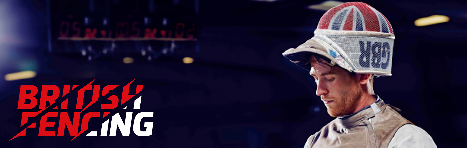
British Fencing (BF) is the National Governing Body (NGB) for the Olympic and Paralympic Sport of Fencing in the British Isles (excluding the Republic of Ireland). British Fencing exists to serve the athletes, clubs, coaches, referees and countless volunteers who make up the British Fencing community.
Their main frustration was that the website was very busy. Being a governing body, they had a lot of information on the website that was really helpful for the users, however it needed to be easier to access. They also wanted everything to be highly accessible. Overall, they wanted the website to be user friendly and informative, encouraging users to become members of British Fencing.
My Role:
UX/UI Designer, UX Researcher, Information Architect
Goals & Objectives:
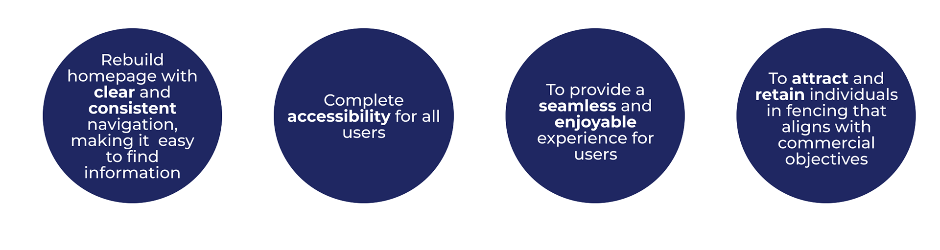
Problem Space:
- Existing website is hard to navigate.
- The Information Architecture is complicated and has duplicated links.
- New users may be overwhelmed with the amount of content and get lost in the website.
- Existing website is hard to navigate.
- The Information Architecture is complicated and has duplicated links.
- New users may be overwhelmed with the amount of content and get lost in the website.
Competitive Analysis:
Compared NGBs websites (National Governing Bodies) for different sports in the UK as well as NGBs for Fencing from other countries.

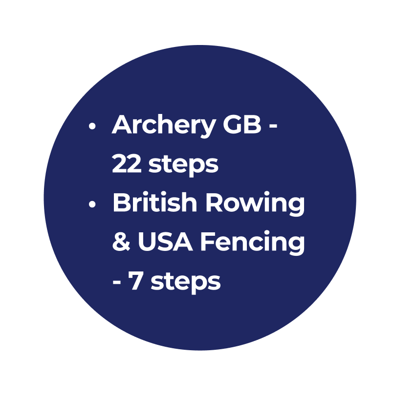
Competitive Analysis - Task Analysis:
Task: Sign up process and joining membership
Key Insights:
British Fencing & Archery GB had repetitive steps when it comes to filling in details/registering on the membership section
British Rowing & USA fencing are both concise & easy to navigate within the given task.
Task: Sign up process and joining membership
Key Insights:
British Fencing & Archery GB had repetitive steps when it comes to filling in details/registering on the membership section
British Rowing & USA fencing are both concise & easy to navigate within the given task.
User Interviews:
The main goal of conducting user interviews was to understand the pain points of the website for both existing users and new users.
We interviewed 13 users:
- 5 existing users of the site.
- 8 new users who had not used the British Fencing website before.
I conducted a brief moderated usability test of the existing website with new users to get a sense of how they felt navigating the current website.
I asked them to :
1. Navigate to “We Are Forging Futures” page.
2. Sign up to become a member.
3. Find information regarding updates.
I asked them to :
1. Navigate to “We Are Forging Futures” page.
2. Sign up to become a member.
3. Find information regarding updates.
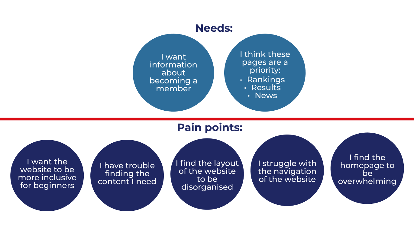
We got really helpful insights from our research. Here you can see the main Needs and Pain points that came from our user interviews:
User Journeys:
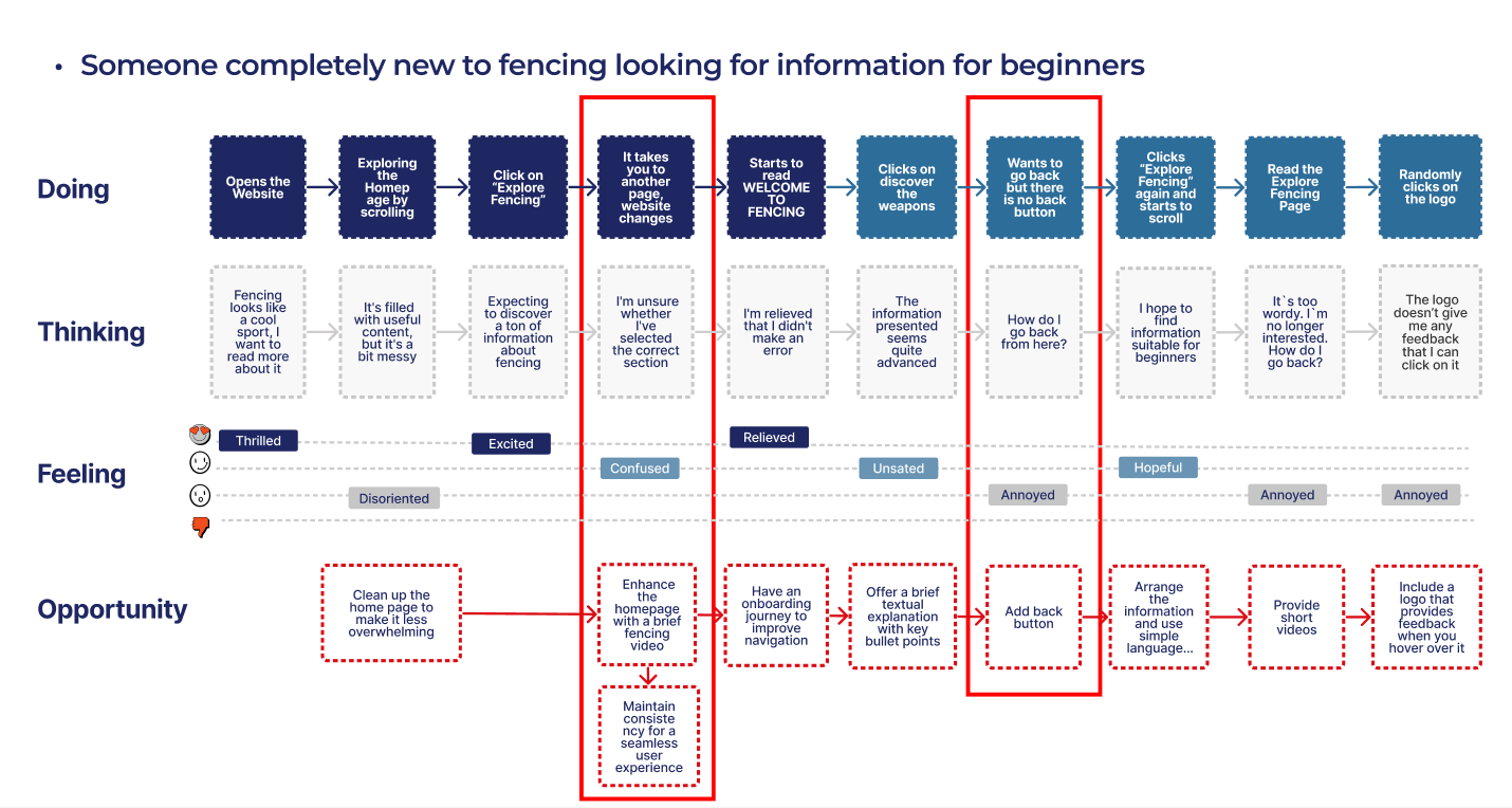
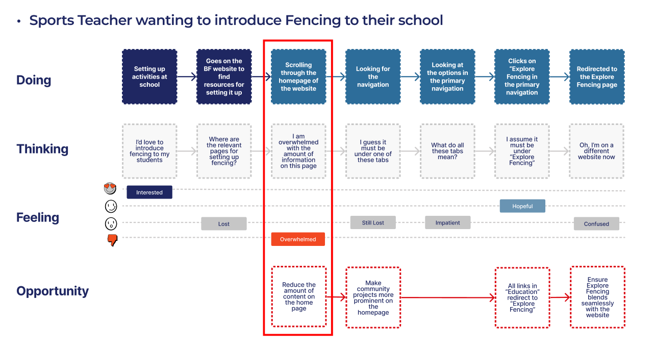
We created 2 separate user journey's - one for the new user and one from the deliverer. I have highlighted the main pain points in the journey that we needed to focus on going forward. There were many points in the website which caused confusion to the users, especially someone who had never used this website before.
User Journey - New User:
User Journey - Deliverer:
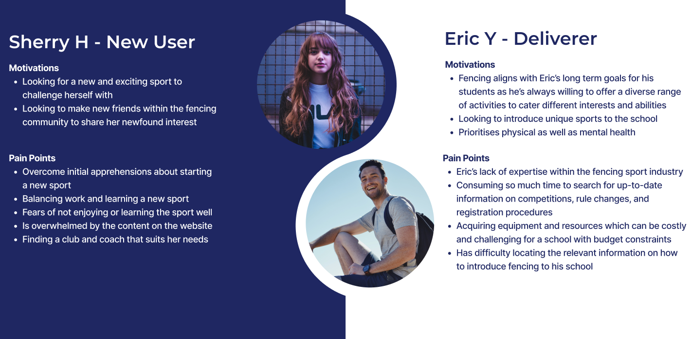
Personas:
Based on our research, I created 2 user personas - The User and the Deliverer. Due to the time restraint, we decided to focus on the new users of the website and going forward, focus on Sherry's journey.
Card Sorting:
Since I had assumed the role of the Information Architect, I set up an open card sort using Optimal Sort. We gave users cards with all the headings from the primary navigation and asked them to categorise them how they thought fit. Here were the results from this exercise:

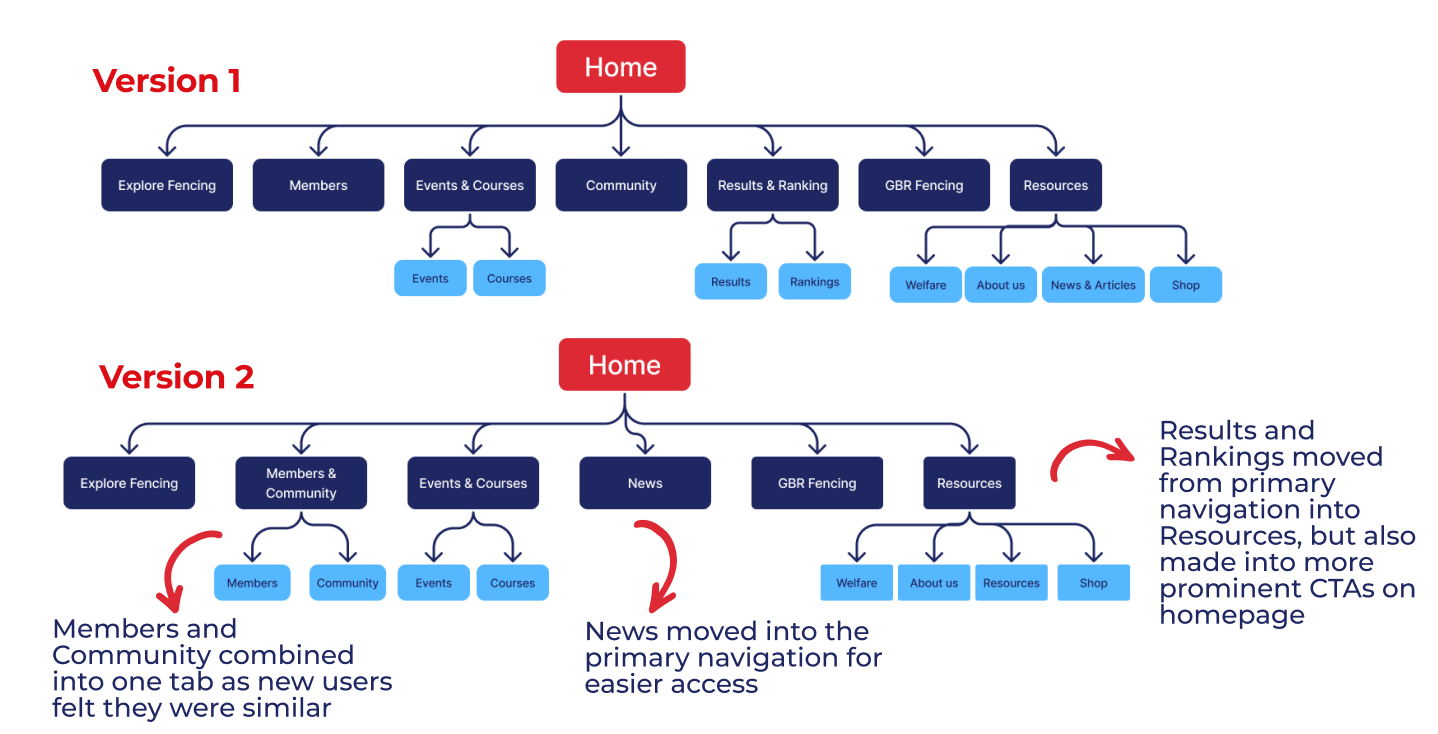
Site Map:
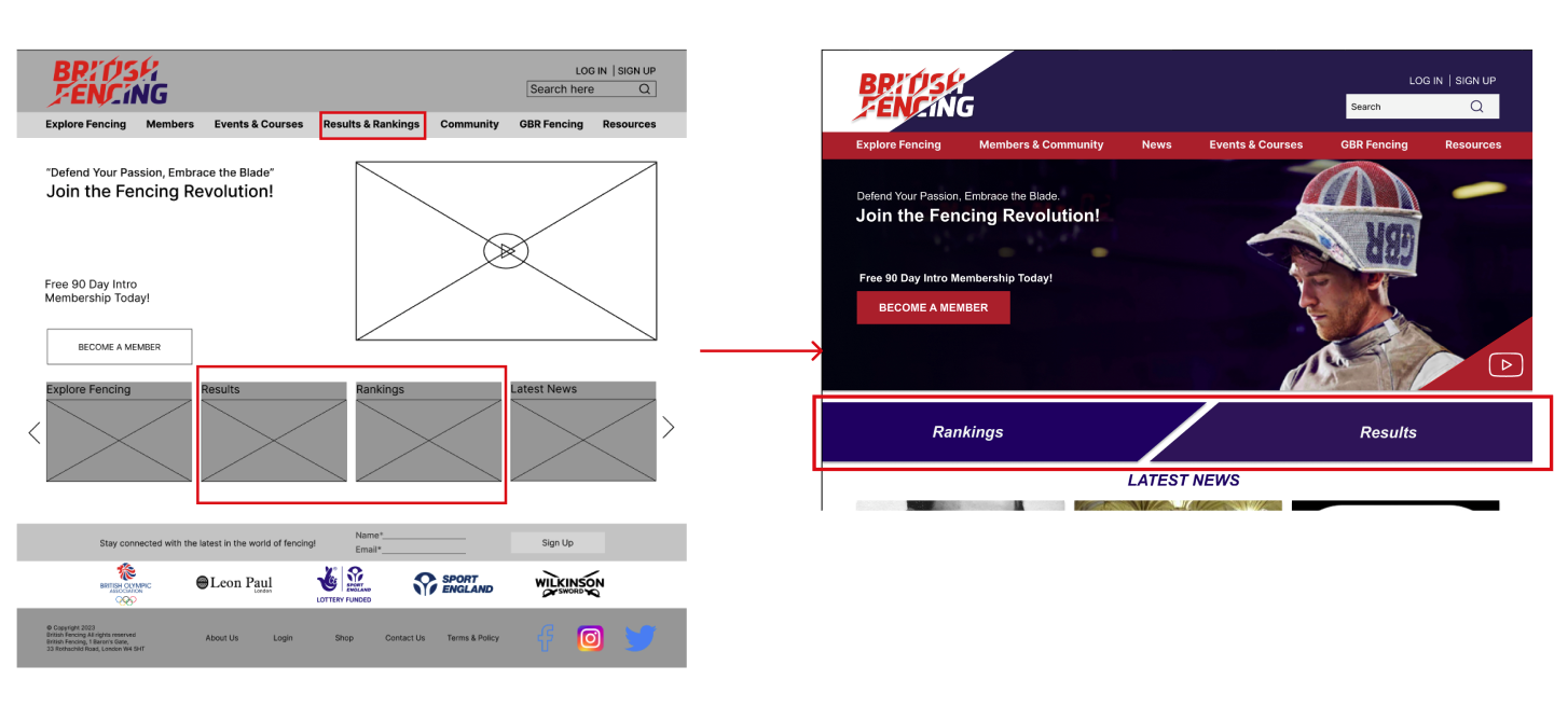
After we had looked at insights from our card sorting, I created a site map to reflect our new headings. We iterated the first one to create a more refined version on it after we got feedback from the client. The 'Results& Ranking' section is something they wanted more visibility on as a lot of the returning users come to the website to check that tab. We decided to put it as a prominent CTA on the homepage for easier access and also put it under 'Resources' if someone wanted to go through the main menu.
Design Studio:
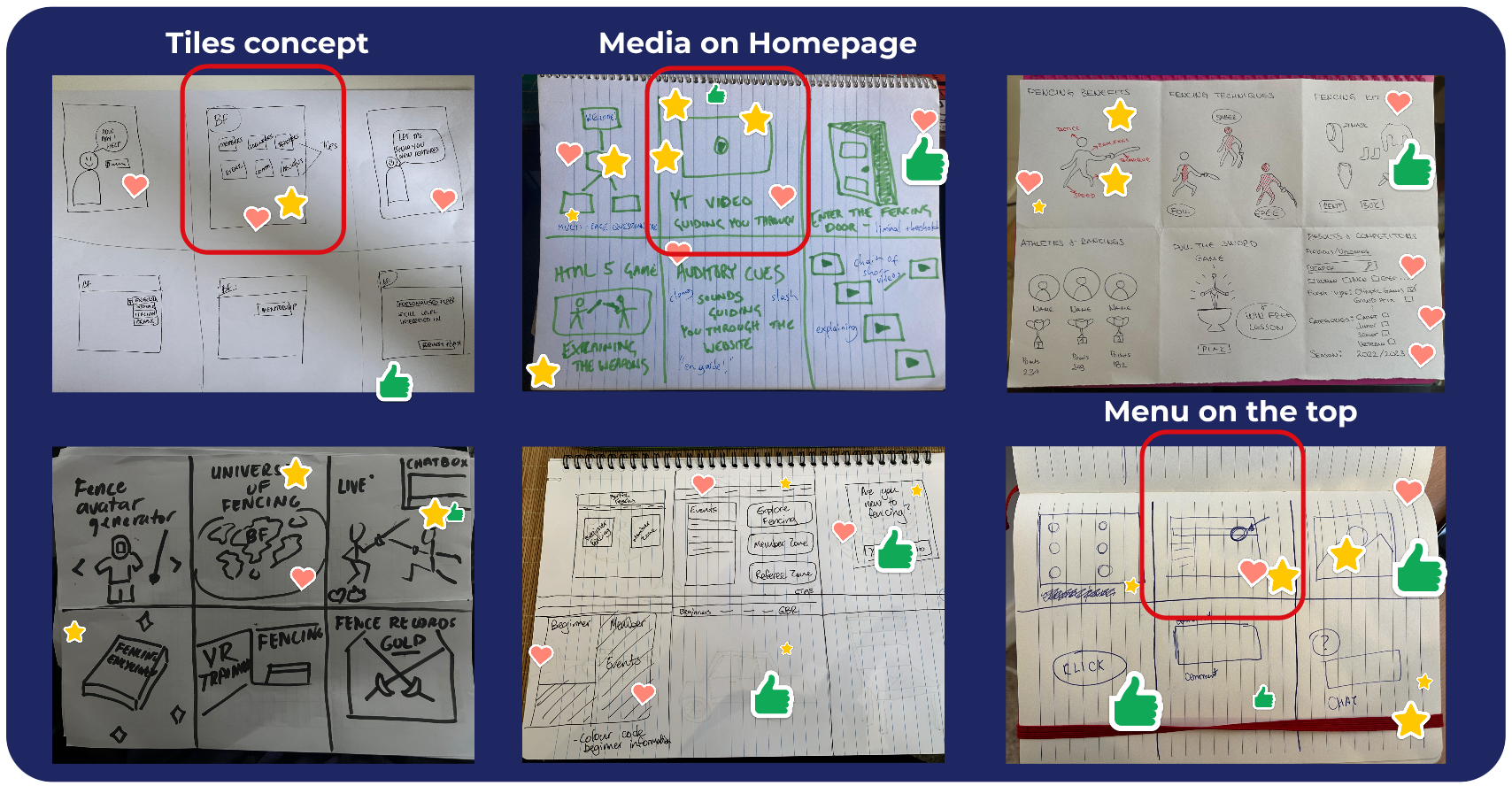
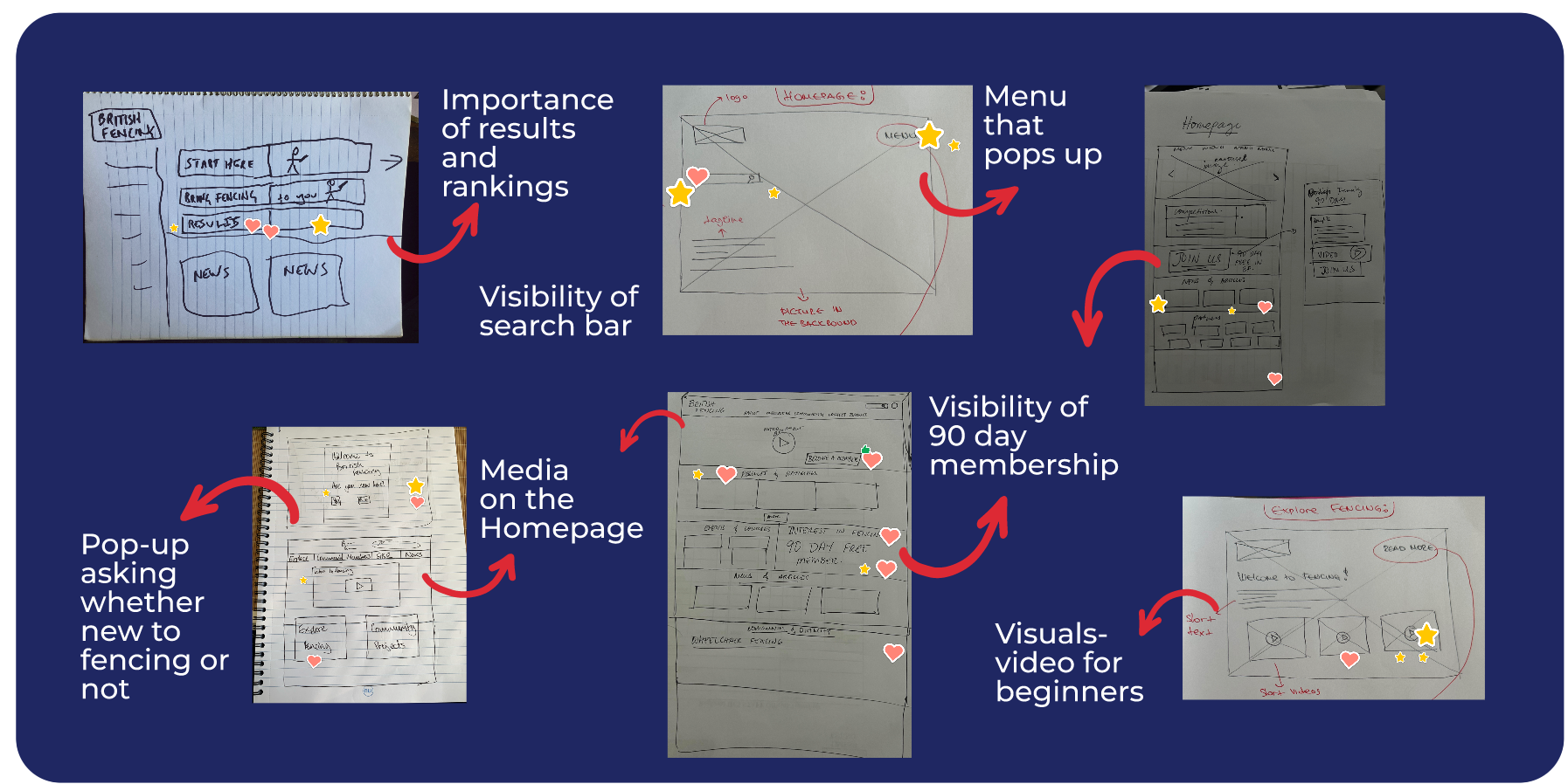
We invited the client and their team to participate in a design studio with us. This gave us the opportunity to brainstorm ideas with the client and see what ideas they had in their mind to incorporate these into our designs. We did 3 rounds of sketching facilitated by me to get ideas on how to design the homepage. Each round was an iteration on the best ideas of the round before, which everyone voted on at the end of reach round. We finally all created some sketches and had some good direction on getting started with Low/Mid Fidelity Wireframes.
Here are the highlights from our design studio:
Design Studio
Design Studio

Sketches
Sketches
Homepage Sketches

Homepage Sketches
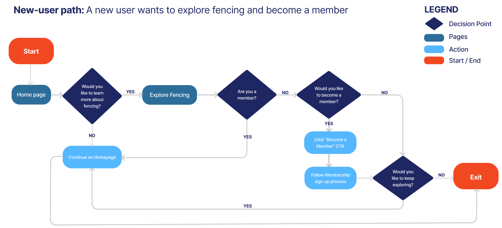
User Flow:
Below you will see the user flow created for a new user wanting to learn more about fencing and become a new user. We created this to help us have a flow on how a user would get from 'Start' to 'Finish' with the best possible path. Creating a user flow helps me as a designer to create screens that have a positive journey for the user.
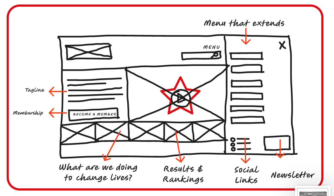
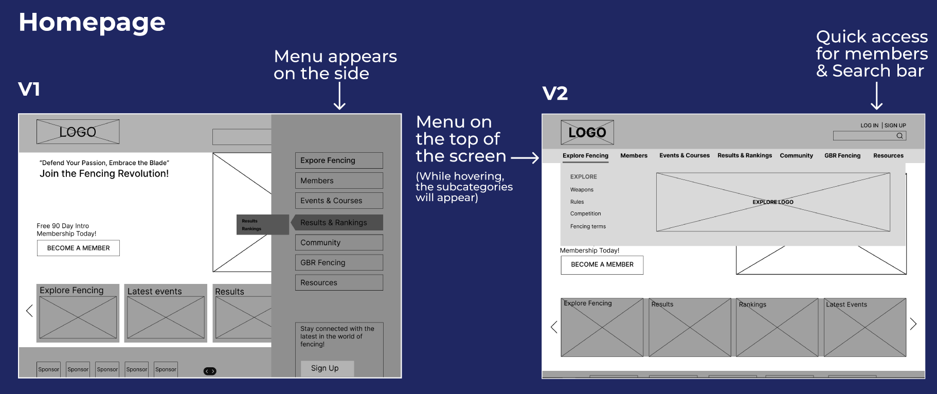
Low Fidelity Wireframes
Using the sketches from our Design Studio, we created low fidelity wireframes. You can see the iterations from version 1 to version 2. We changed the menu bar from a side navigation to a Mega Navigation bar on top as Primary Navigation because it gave more visibility instantly for all categories for users. We also added a more visible search bar on the top right corner of the page.
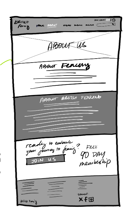
Mid Fidelity Wireframes:
We started adding Logos and ore details on the Mid Fidelity Wireframes and then we were ready for testing!
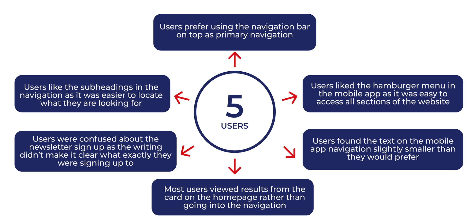
Usability Testing:
Usability Testing is a useful way to find out what users are thinking and get feedback on the design of the page before designing further in High Fidelity. We tested 12 users and we gave them 4 tasks to complete:
1. As someone who is looking to get into fencing, you want to learn more about what fencing entails, where you might find information for beginners
2. How would you become a member?
3. You would like to see the outcomes from the latest fencing competition, how might you find this information?
4. Did you have any difficulties with any of these tasks? If so, please explain below.
2. How would you become a member?
3. You would like to see the outcomes from the latest fencing competition, how might you find this information?
4. Did you have any difficulties with any of these tasks? If so, please explain below.
For our testing, we used Maze to do unmoderated user testing. Below you can see the heatmaps with the hotspots and some results that we got.
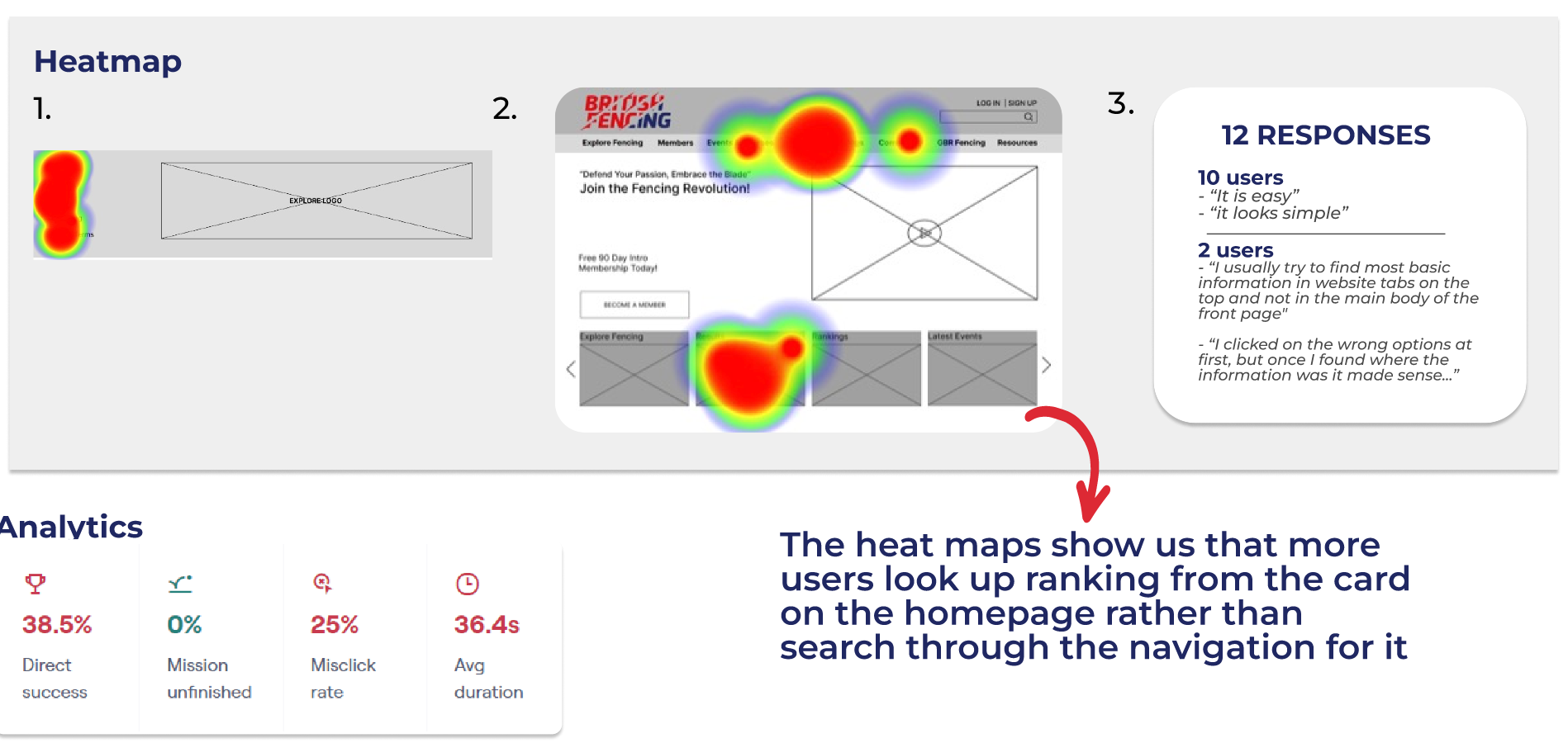
Insights from Usability Testing:
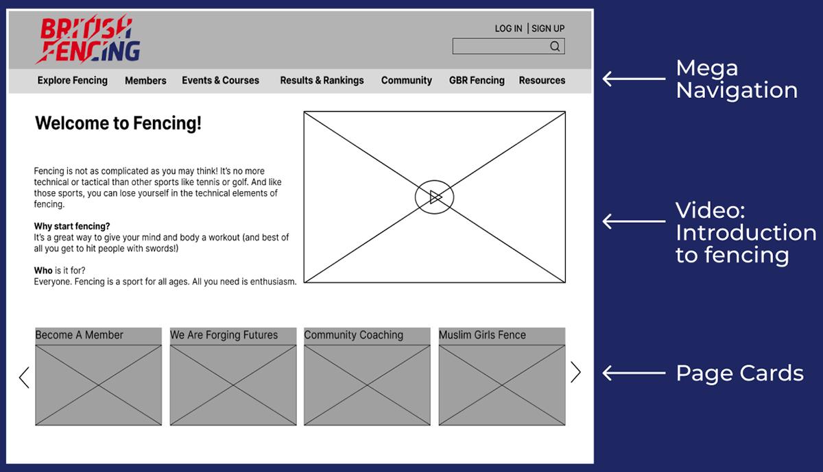
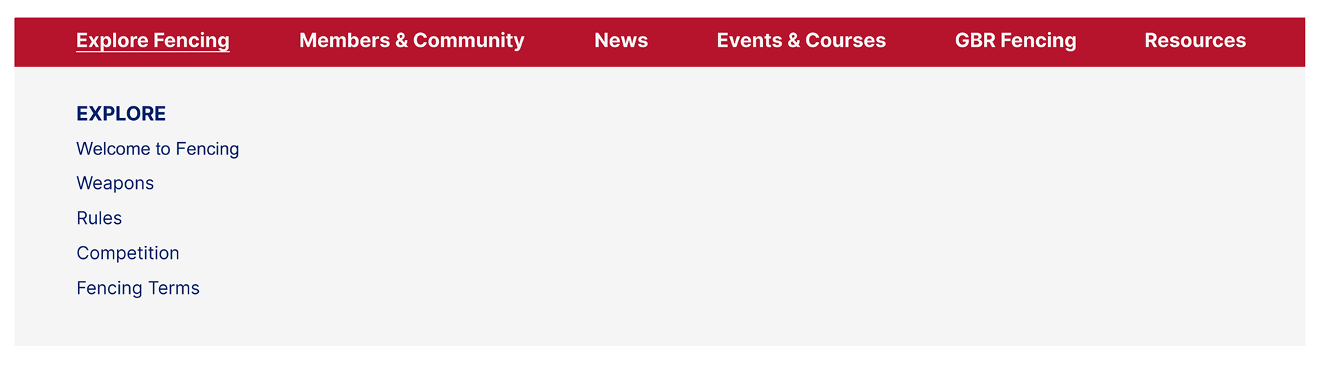
The Navigation Bar:
The Navigation bar was going to be a crucial part of the website. I had been the Information Architect on this project and so we decided that I would create the Mega Navigation bar that we would use on the website. This was a fantastic opportunity for me to try and create a well functioning bar and it was really challenging as it had a lot of information and links that needed to be easily accessible by users. You can see some screenshots of the navigation bar as I was creating it.


High Fidelity Wireframes:
The best part about creating High Fidelity Wireframes is that you see your hard work and vision coming to light. We took our results into considerations and created our High Fidelity wireframes. We created 'Results & Rankings' as a visible CTA on the homepage and merged them into one button.
Further Iterations:
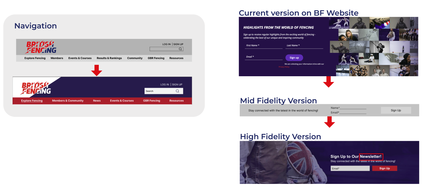
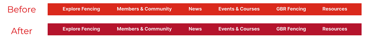
Below you can see the evolution of the navigation bar and of the newsletter signup. We created these using feedback from our testing and feedback from our clients as well.
Usability Testing For High Fidelity Wireframes:
I did 5 moderated usability tests with our High Fidelity wireframes. After that, we took the results to implement some changes to our final outcome
Users wanted consistency of the reds used so we changed the colour of the navigation bar to match Call to Action buttons. This also improved the accessibility rating from AA to AAA compliant.
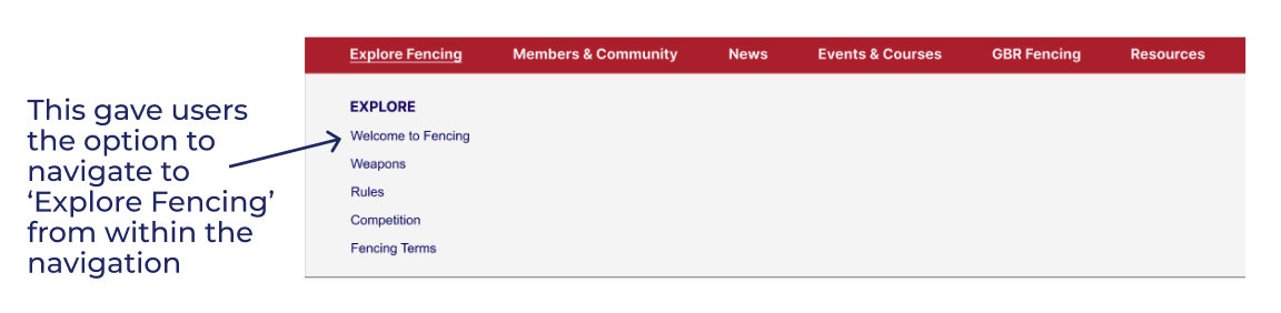
Users found it hard to go to ‘Explore Fencing’ so we added a new link called ‘Welcome to Fencing’ increasing the visibility.
Accessibility:
It is really important that the website is accessible so that it is inclusive to everyone. I ran checks on the website and the entire website is at least AA compliant. Changing the red in the navigation bar helped the contrast improve, the buttons had no issues with accessibility as well. The cards created were AA compliant but users had no problems interacting with them in our usability testing.

Final Prototype:
You can view the final prototype here.
Next Steps:
- Change the fonts to match the British Fencing style guide.
- Continue to develop the mobile viewport, making it into a HiFi prototype.
- Add the pop-up message for the onboarding process that was discussed in the design studio.
- Further refinement of the sitemap and navigation.
- Add more feedback to elements on the page so users know what is clickable.
- Further testing to keep improving user experience and accessibility.
Conclusion:
I really enjoyed working on this project. British Fencing was a wonderful company with great vision. They gave us great feedback on the project and you can read the post about us on their website on the following link:
This project made me focus a lot on Information Architecture and that was a great learning experience for me. I achieved a great sense of achievement by building the Mega Navigation and getting it to work after multiple iterations.
It was also the first time that I facilitated a Design Studio completely by myself and I really enjoyed it. This experience taught me that I enjoy facilitating meetings, workshops and interactions.
I enjoy working in a team and I believe that this project showed me that having a strong team really helps in bringing together ideas and putting them in place.