
UI Design | Conceptual Project | 1 Week Sprint | Solo Project | September 2023
Brief:
To create a reskin of the Irish Shipwreck Website with a focus on feature prioritisation.
My Role:
UI Designer, Information Architect, User Researcher
hi
Introduction:
Irish Shipwrecks is a website that has a database of shipwrecks near Ireland. It gives a lot of useful and detailed information about the ships and how they may have become wrecks. There are also pictures added wherever available. It reads like a database but is not very user friendly or visually appealing.
This was a 1 week sprint just focused on the UI so I knew I would have to focus solely on competitive analysis and other research on competitors to build a website.
UX Audit:
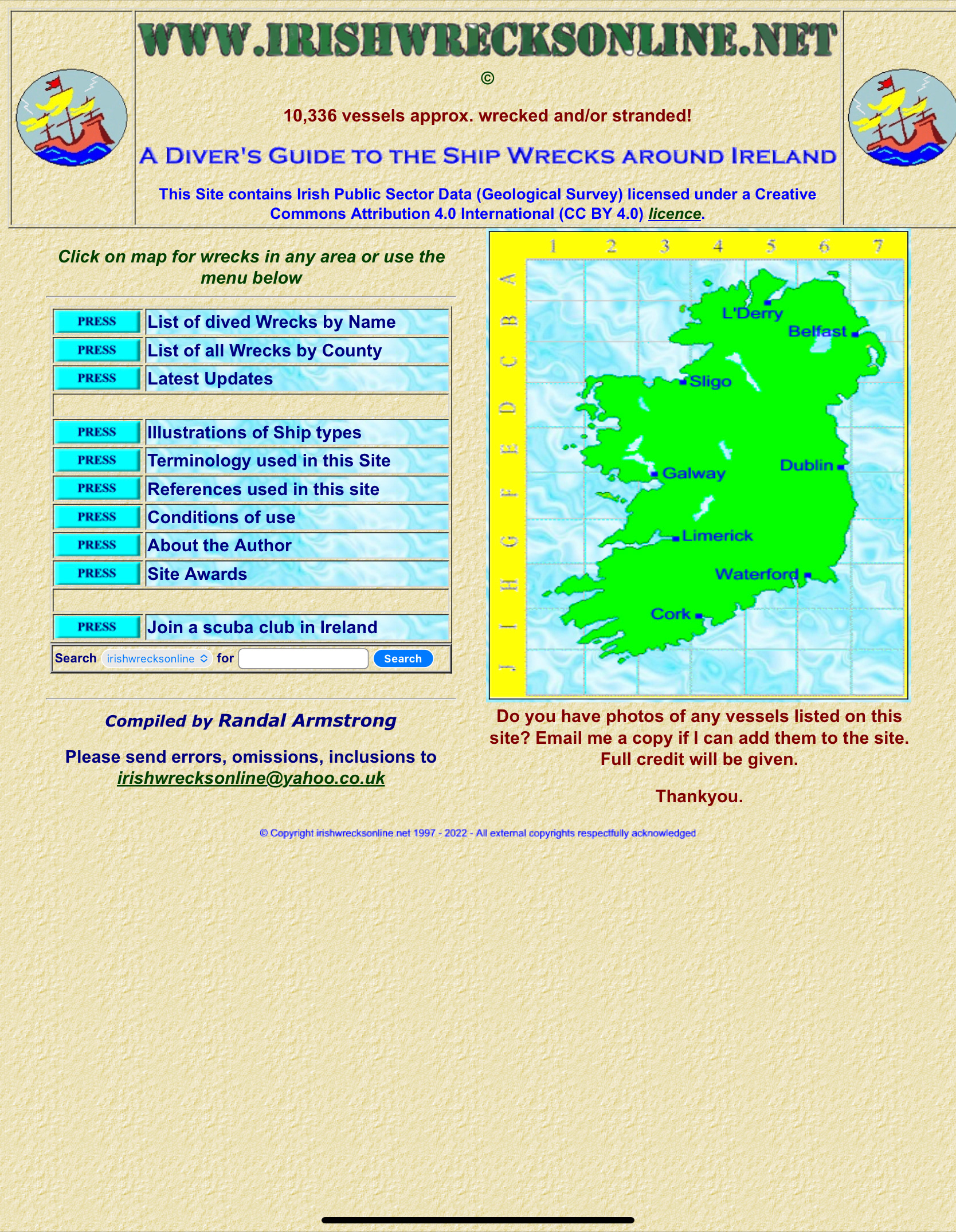
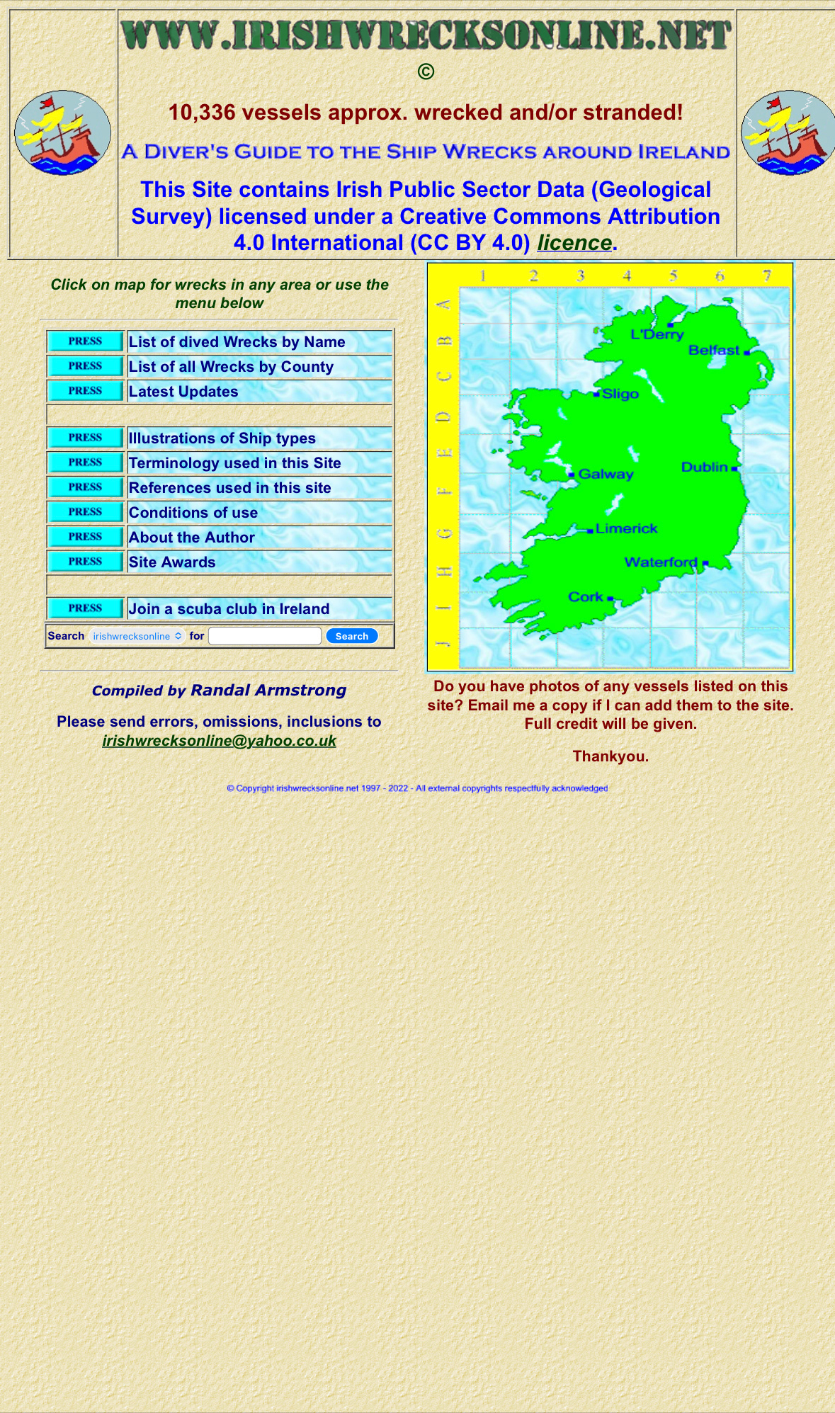
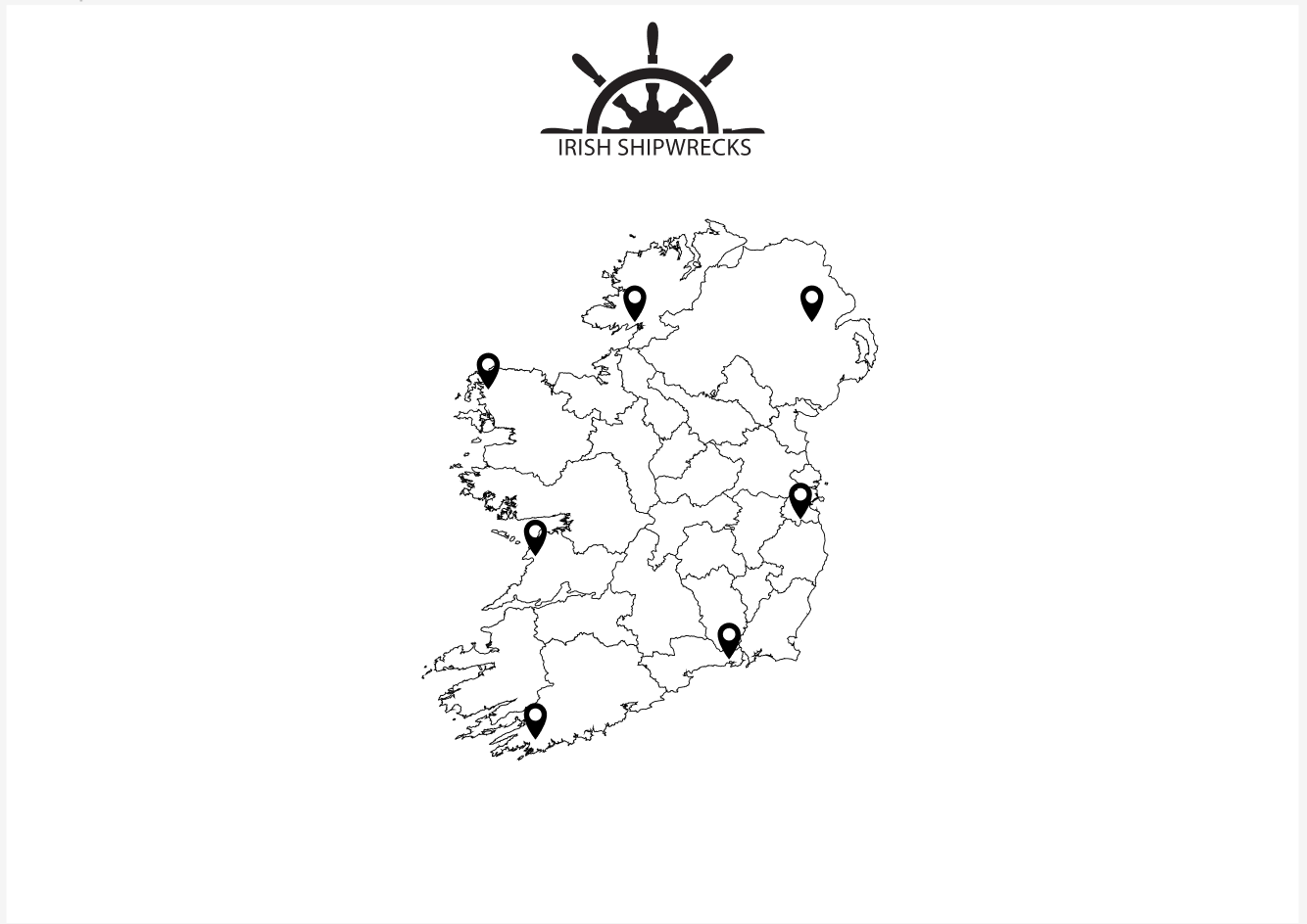
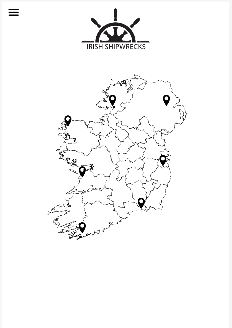
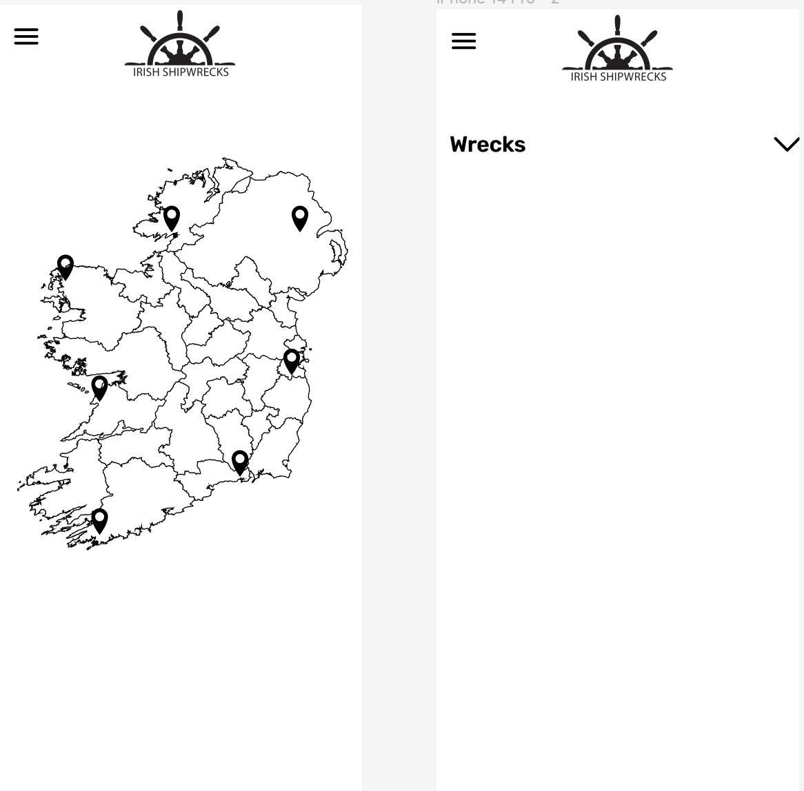
I decided to start by looking at the current website and trying to conduct an audit on it. This was the original website. I am sharing a screenshot of the desktop, tablet and mobile view as the idea was to make a responsive design as a final product.
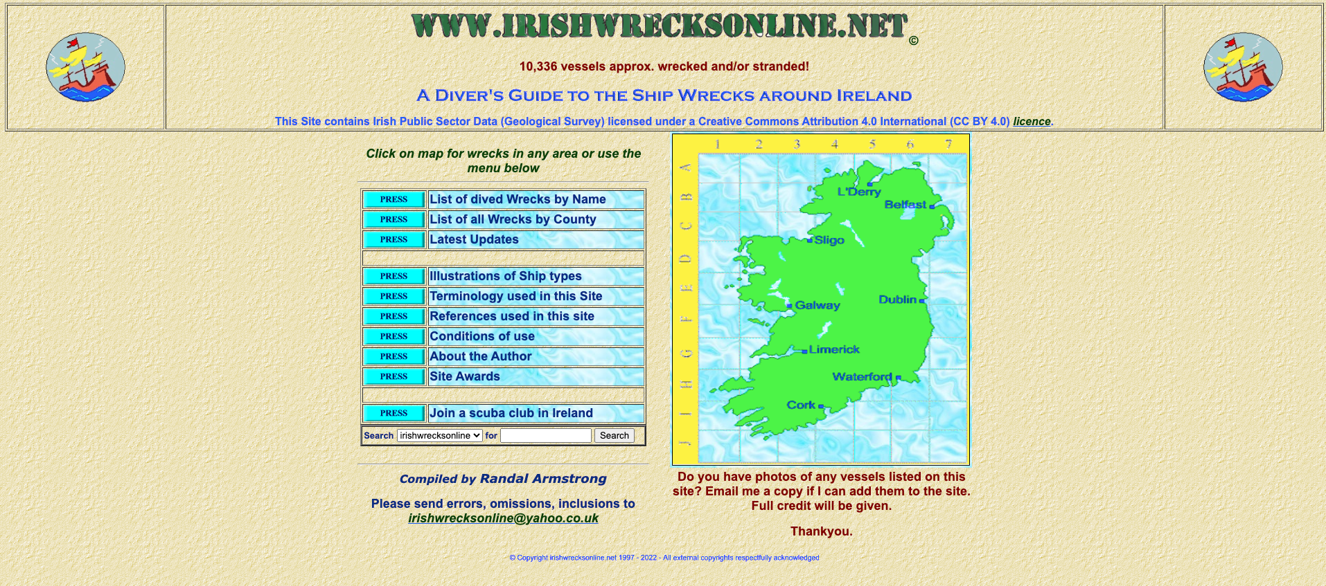
Desktop
Tablet
Mobile
- The website had a lot of good and relevant information on it however it was really hard to navigate through it as there was a lack of hierarchy.
- The aesthetic of the website felt very old and not modern at all, which may not attract users to search for information here.
- The architecture made it difficult to sift through a lot of information to access what the user was looking for.
Branding Strategy:
I decided to think about what I wanted the website to look like and the general feel and aesthetic of the website that I wanted to create. I created a branding strategy for Irish Shipwrecks with a plan of how to go forward, what to add and what the brand personality would look like:
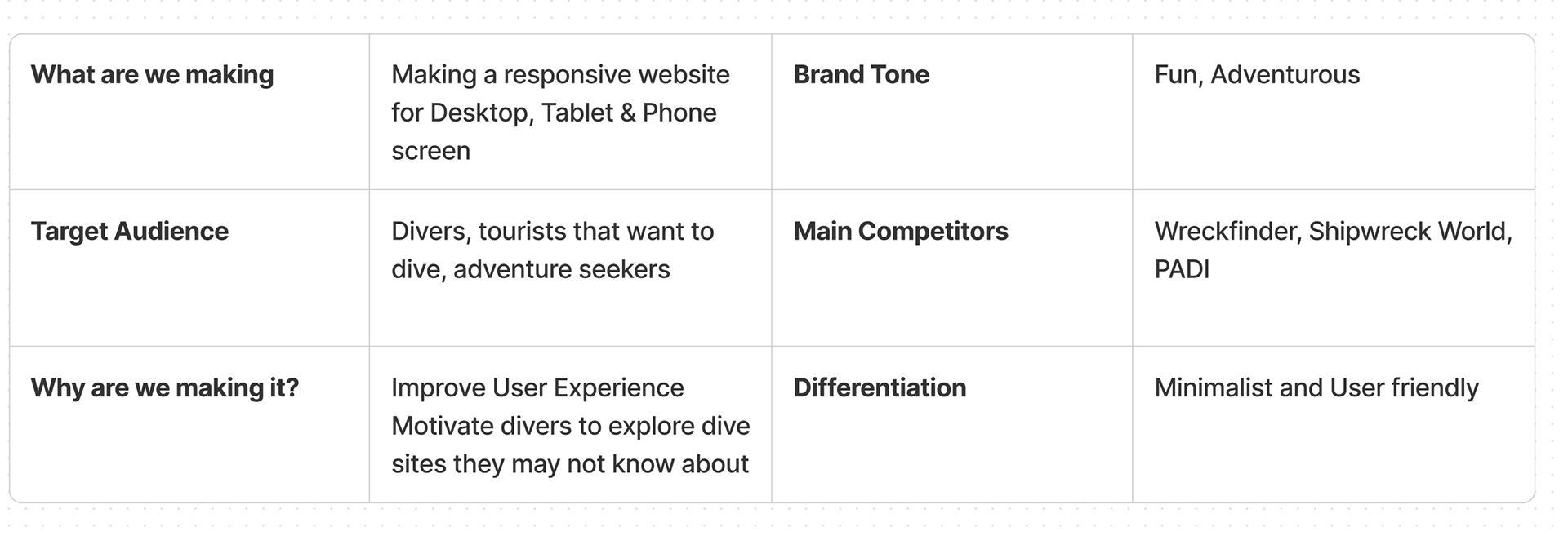
Brand Strategy
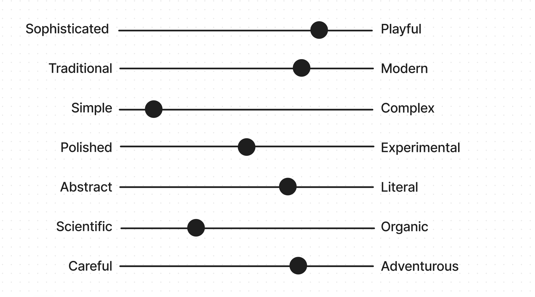
Brand Tone:
I created scales to start thinking about the tone that the brand would have. I wanted to create something really modern and clean, that would appeal to a users who were interested in finding shipwrecks and information about them.
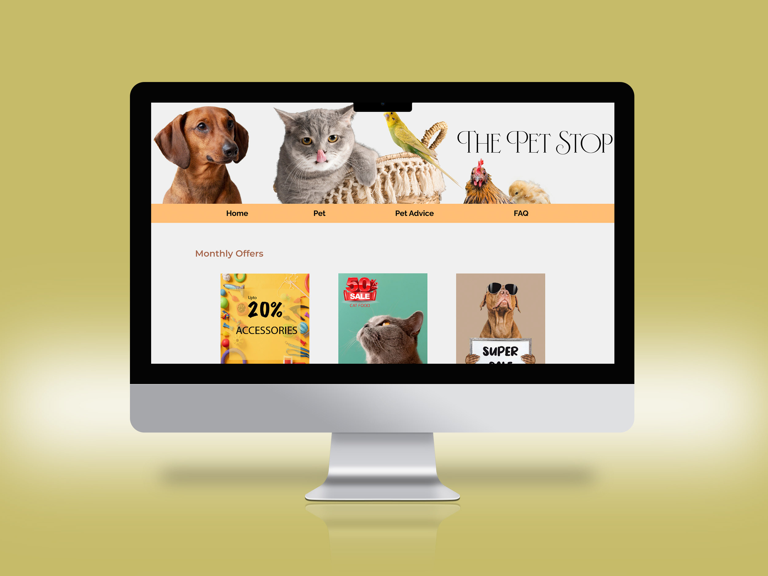
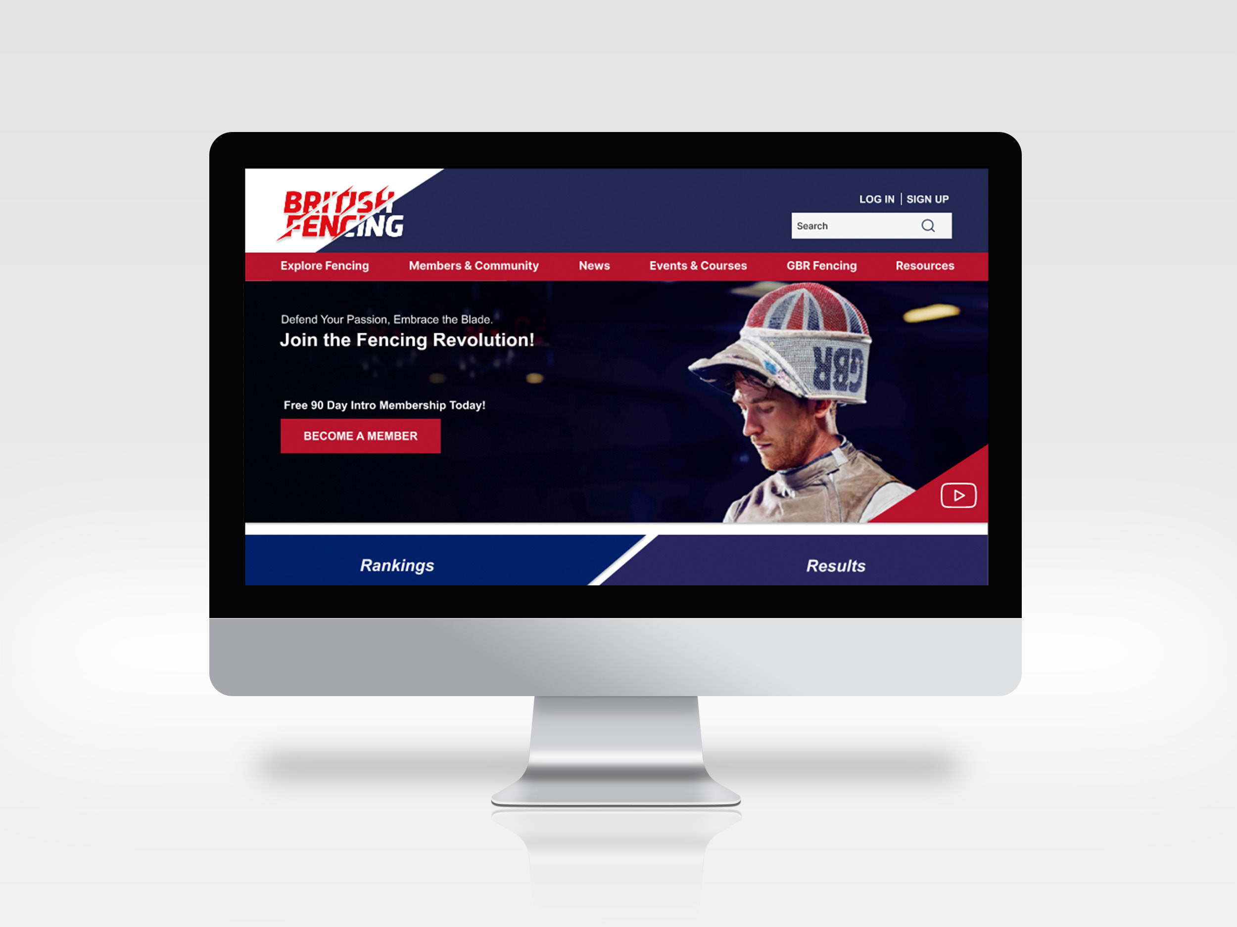
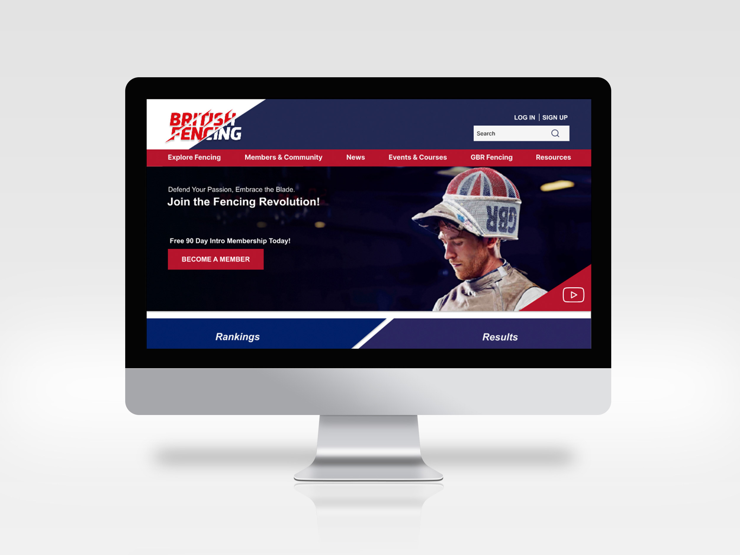
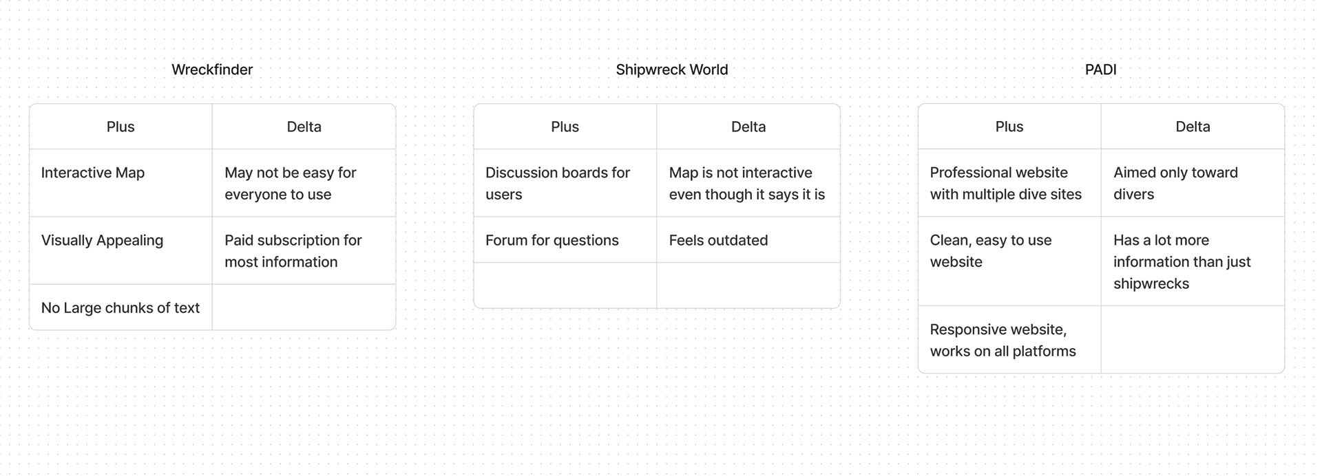
Competitive Analysis:
I identified 3 websites that were Irish Shipwrecks' competitors. For the competitor analysis, I did a pluses and delta for them to compare with Irish Shipwrecks and these were the results:
Design:
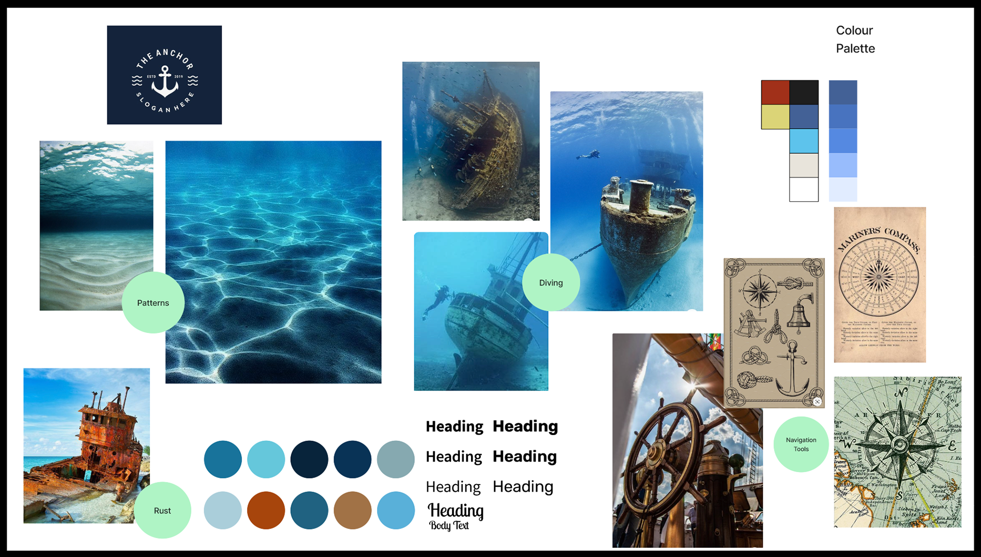
I created a mood board to get the feel of what I want the website to look like. I found colours, pictures and patterns which felt like they match the brand personality and decided to start designing with that. I liked the idea of having lots of shades of blue. The natural patterns that emerge in nature are amazing and it would have been amazing to try and incorporate that into my designs.
I used a colour picker from my mood board to create two colour palettes and I started to envision a design with colours in my mind.
The original website is like a big database and has a lot of useful information so it was all about creating good navigation to access all this information while keeping it visually appealing.
Low/Mid Fidelity Wireframes:
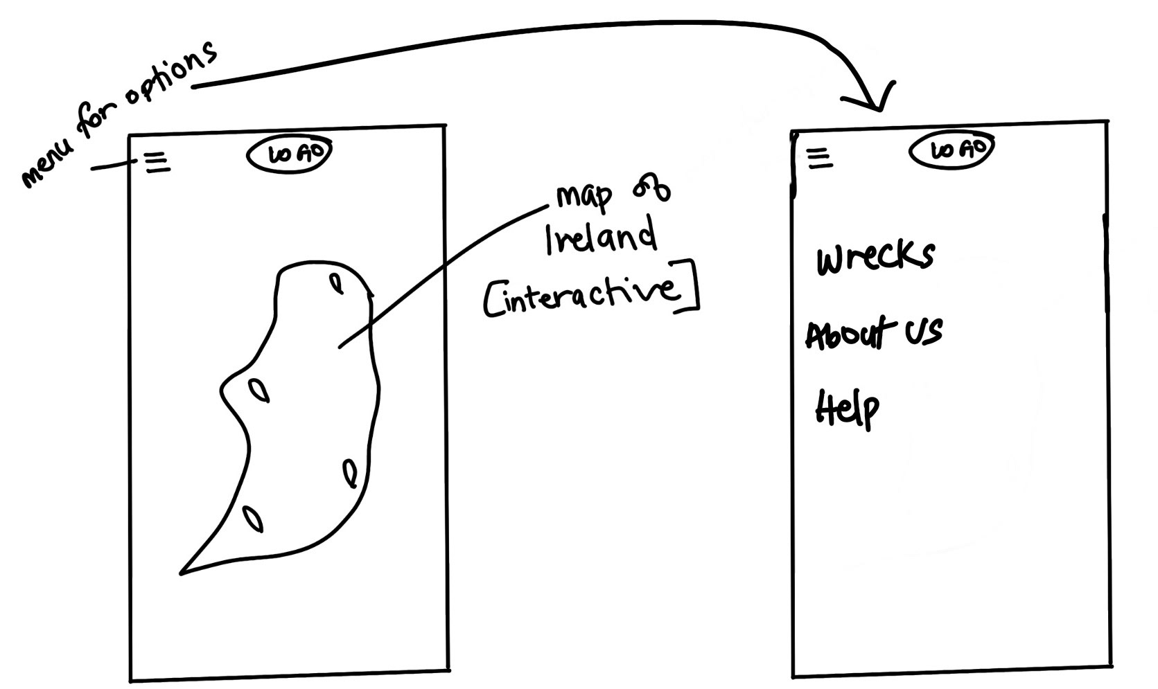
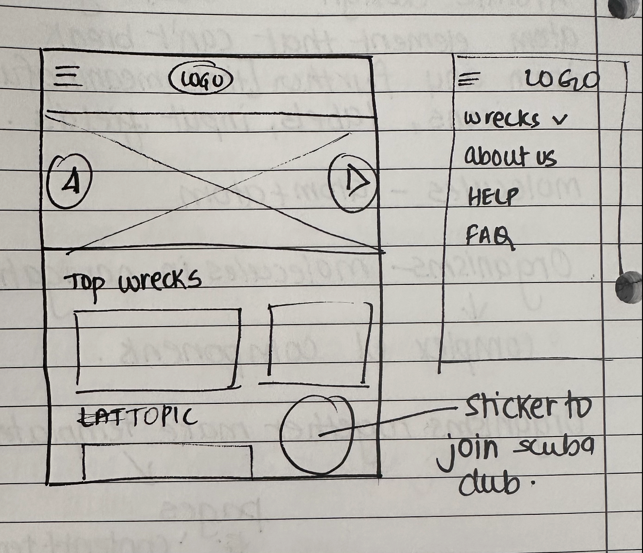
I decided to start designing with a very minimal theme in mind. I started sketching some screens for the homepage and thinking about responsive design. I sketched screens for mobile, tablet and desktop and then started creating wireframes.
I created a map on the homepage with the idea that it would be interactive with the user. You would be able to click on the pinned areas and it would tell you which wrecks are around there.
Version 1 - Sketches
Desktop
Tablet
Mobile
Iterations:
Once I had created the wireframe, I felt like it looked too small on the mobile screen and accessibility was my concern as it wouldn't be easy for fingers to tap on the map on a smaller screen.
I iterated on the design to create a new version of the homepage which had more pictures and would be visually exciting for the user. A carousel on the homepage with stunning pictures of the wreck was the hero on the page. I had an image of fun visuals which make you want to travel to different parts of Ireland to see the different wrecks. The pop-up menu gave users access to the different wrecks by country, by ship name and kept options to access the illustrations of the ships and information about the owners of the website and the information they provide.
Iterated sketch for the updated version of the homepage
Desktop
Tablet
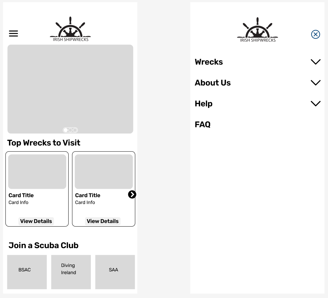
Mobile
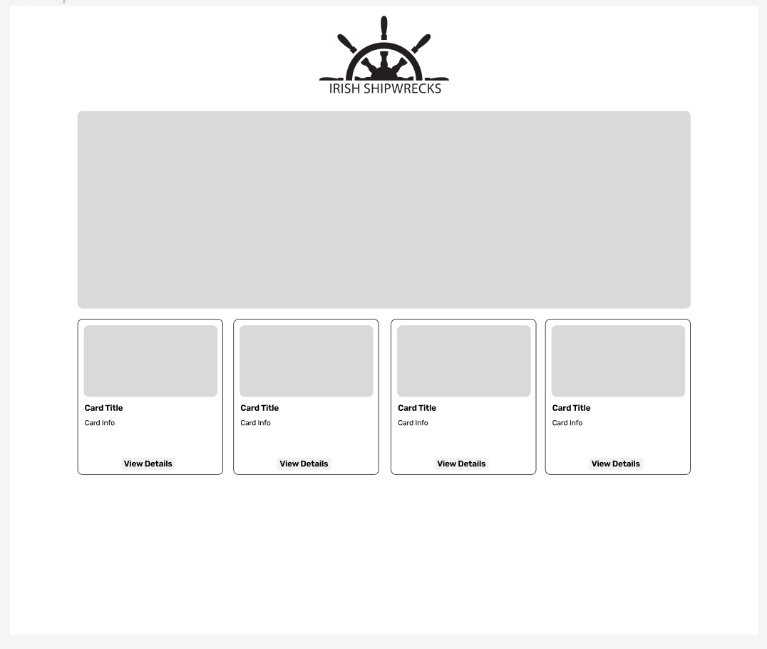
Style Guide:
Creating a style guide was key. I created components for all three viewports which would help me when creating my high fidelity prototype. I finalised my colour palette from the mood board I had made earlier. The sizes from my Mid-Fidelity helped to create components for different buttons, the picture carousel and the search bar.
I wanted to keep it very visual and found some stunning pictures of the wrecks. I wanted to maintain the minimalism of the website and give it a clean and fresh look. I created tiles on the page under carousel with a cutout effect to dramatize the names of cities.
This way I had an entire design guide ready to easily create my High Fidelity wireframes.
Style Guide - Movile
Style Guide - Tablet
Style Guide - Desktop
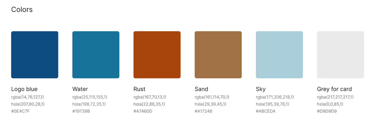
Colour Styles
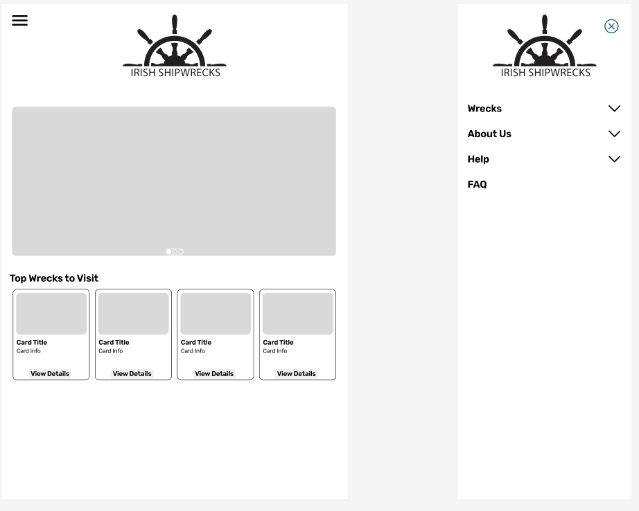
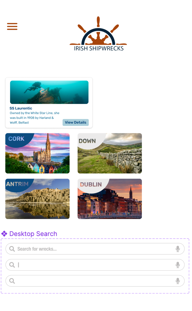
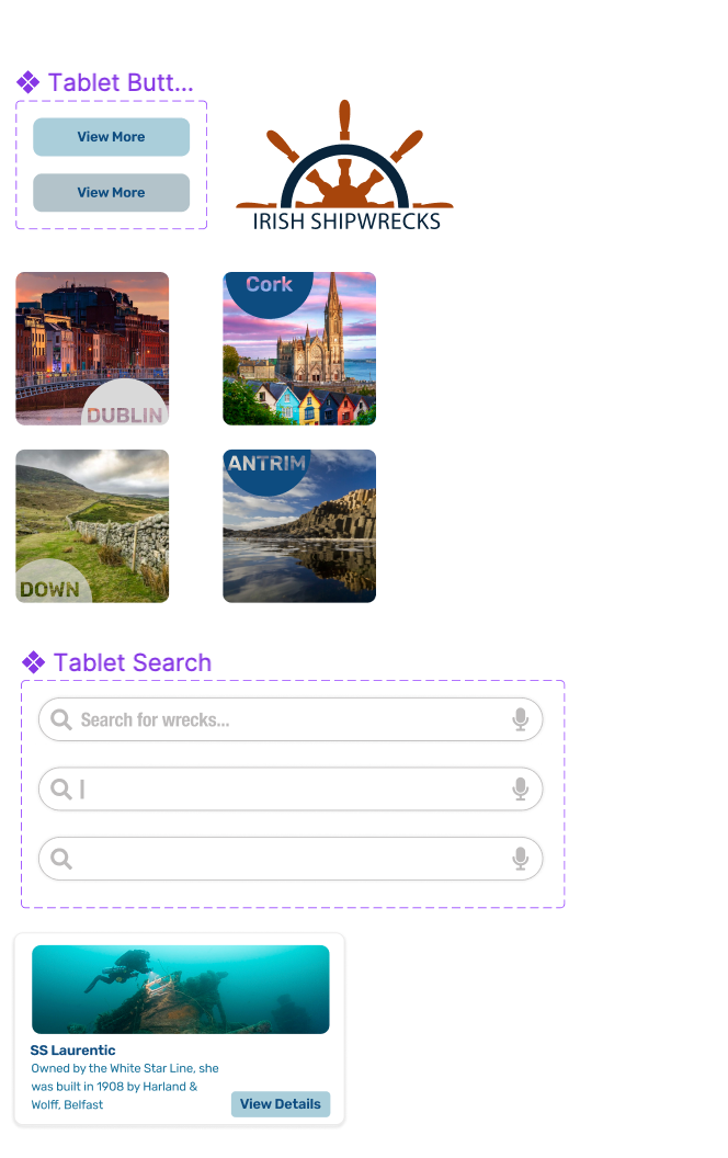
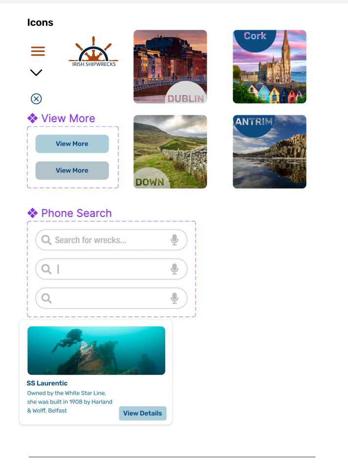
High Fidelity Wireframes:
Creating the High Fidelity wireframes was a culmination of my vision coming together. I added all the elements on the final wireframes. Here you can see all three prototypes that I created on the different viewports: Mobile, Tablet and Desktop.
You can see that as we move from mobile to a larger screen, the hamburger menu opens differently. In the mobile viewport, it takes over the entire screen so that it is easier for the user to make a selection. In the tablet and desktop viewports, the hamburger menu has a smaller pop up and the rest of the screen gets slightly darker so that the menu options are highlighted.
Mobile Prototype
Tablet Prototype
Desktop Prototype
Next Steps:
- Conduct usability testing to find out how users like the design and find out how easy it is for them to use the website on different viewports.
- Further investigation on the accessibility on the website to make sure it is inclusive to all users.
- Iterate on the designs after testing to create more pages on the website.
Conclusion:
This project was a 1 week sprint, which did not give me a lot of time for user research and usability testing. I discovered how difficult it is to make decisions without the research. This challenge taught me how to make quick decisions and prioritise time management.
The opportunity to create a responsive design was exciting and rewarding. I really enjoyed working on the UI and definitely hope to work on more projects focused on visual design!