
UX/UI Design | Conceptual Project | 2 Week Sprint | Team of 3 | September 2023
The Team: Alex Delaney, Eliza Williams, Salony Mirchandani
Programs Used
Programs used
Brief:
Be My Eyes is a free app that connects blind and low-vision people with sighted volunteers and company representatives for visual assistance through a live video call.
Be My Eyes now want to expand their services for the mainstream demographics by building a platform that enables anyone to ask for and give “micro-helps”. Be My Eyes Leadership believe that there is a massive untapped potential in the micro-help market.
Problem:
Our team of 3 was presented with a challenge to expand the target market of Be My Eyes to helping a larger demographic with finding Micro-Helps online.
My Role:
UX Researcher, Competitive and Comparative Analysis, UI Designer, Onboarding
Competitive & Comparative Research:
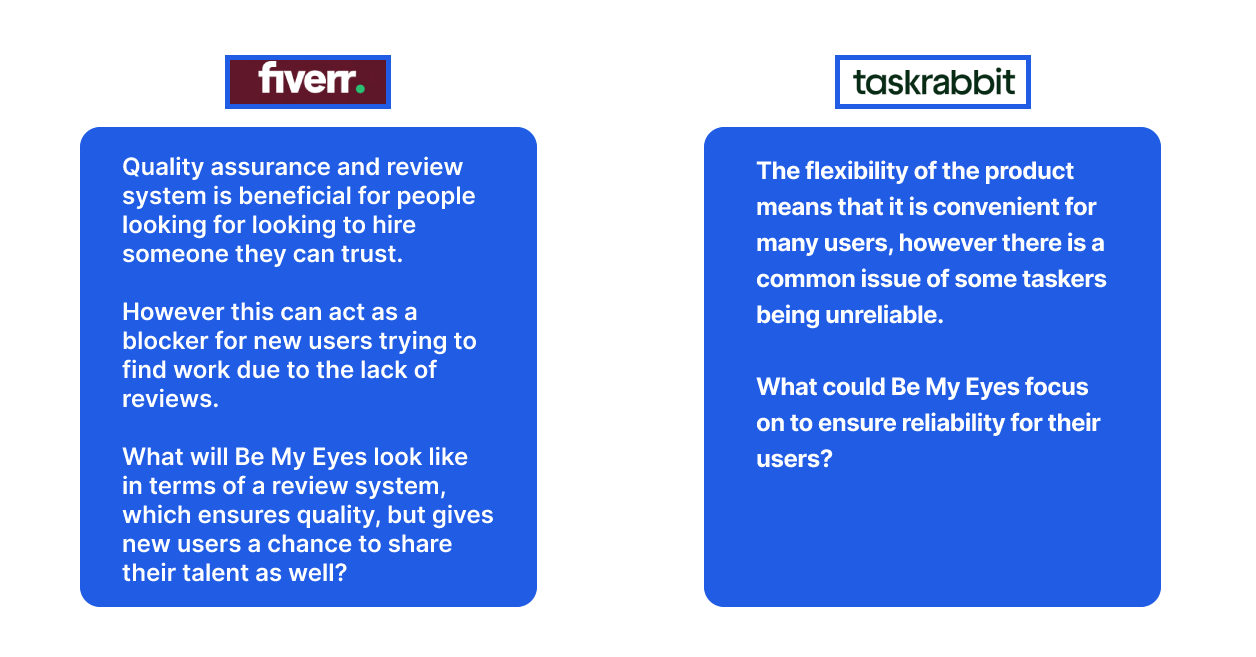
As a team, we decided to look into the main competitors of Be My Eyes in the market to see what features were already available and what we were able to offer differently. The apps we focused on were apps like Aira and Bespecular. We also decided to look into companies that offered services for different kind of helps, such as Fiverr and TaskRabbit. Lastly we decided to look at why people used Youtube for small helps that they could do themselves as well. We all took on different types of analysis and I focused on the feature analysis. Here you see our findings:
Competitive Analysis - Pluses and Deltas:
Comparative Analysis - Task Analysis:
Searching for a tutorial on YouTube
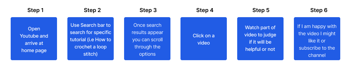
Youtube has a vast range of tutorials available, however it can take time to find the correct tutorial for your ability level (and with an instructor that you can follow and connect with).
While you do have a lot of search results to learn from there is a lot of trial and error until you find the right one. Too many options can also be overwhelming.
While you do have a lot of search results to learn from there is a lot of trial and error until you find the right one. Too many options can also be overwhelming.
Competitive Analysis - Feature Analysis:
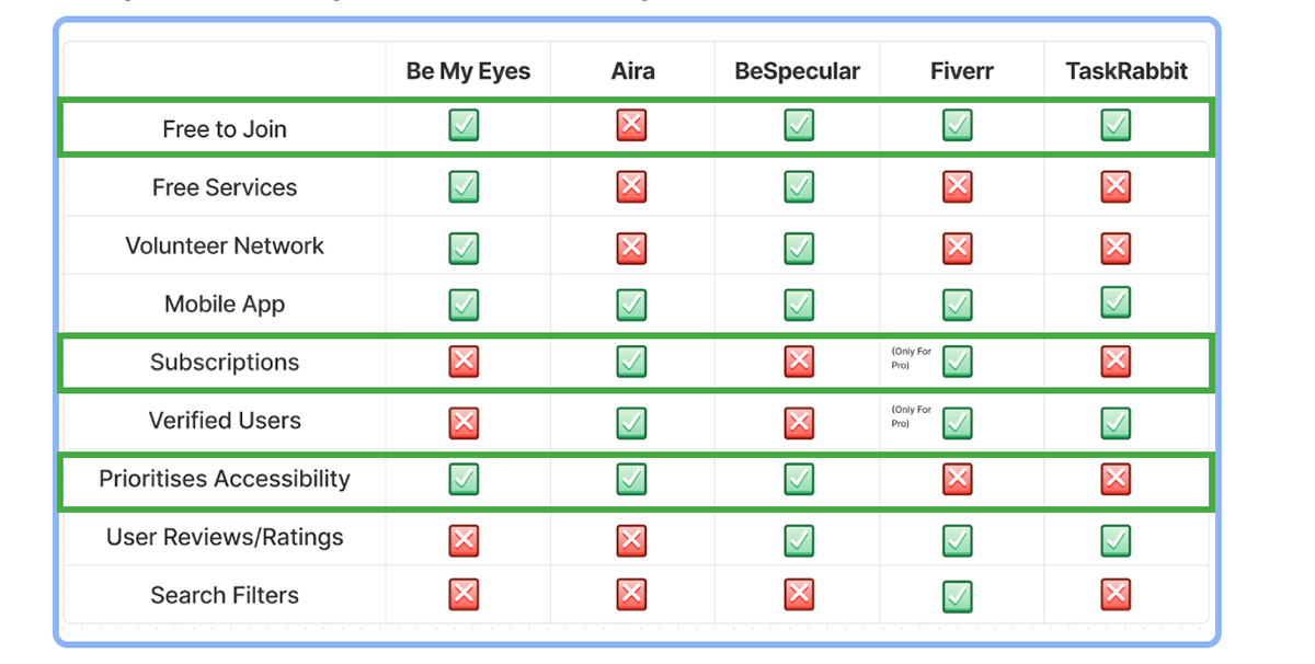
- Most Apps are free to join, however they do require you to have subscriptions or ask you to pay for specific services
- The Apps that prioritise Accessibility are the ones focused on low visibility users as their target market
- Verified helpers are not available on all apps however BeSpecular has a community page where they have recommendations
- The Apps that prioritise Accessibility are the ones focused on low visibility users as their target market
- Verified helpers are not available on all apps however BeSpecular has a community page where they have recommendations
Interviews:
We planned out a discussion guide and went ahead with interviews. I felt like interviews would give us a more in-depth understanding of user needs and wants. We decided to focus our interviews around 3 main themes:

We conducted 15 interviews. We did 5 interviews each and we ended up with our results divided into two main categories:
The Helper - people who would be helping the others in need.
The Helpee - people who are requesting help from the volunteers on the app.
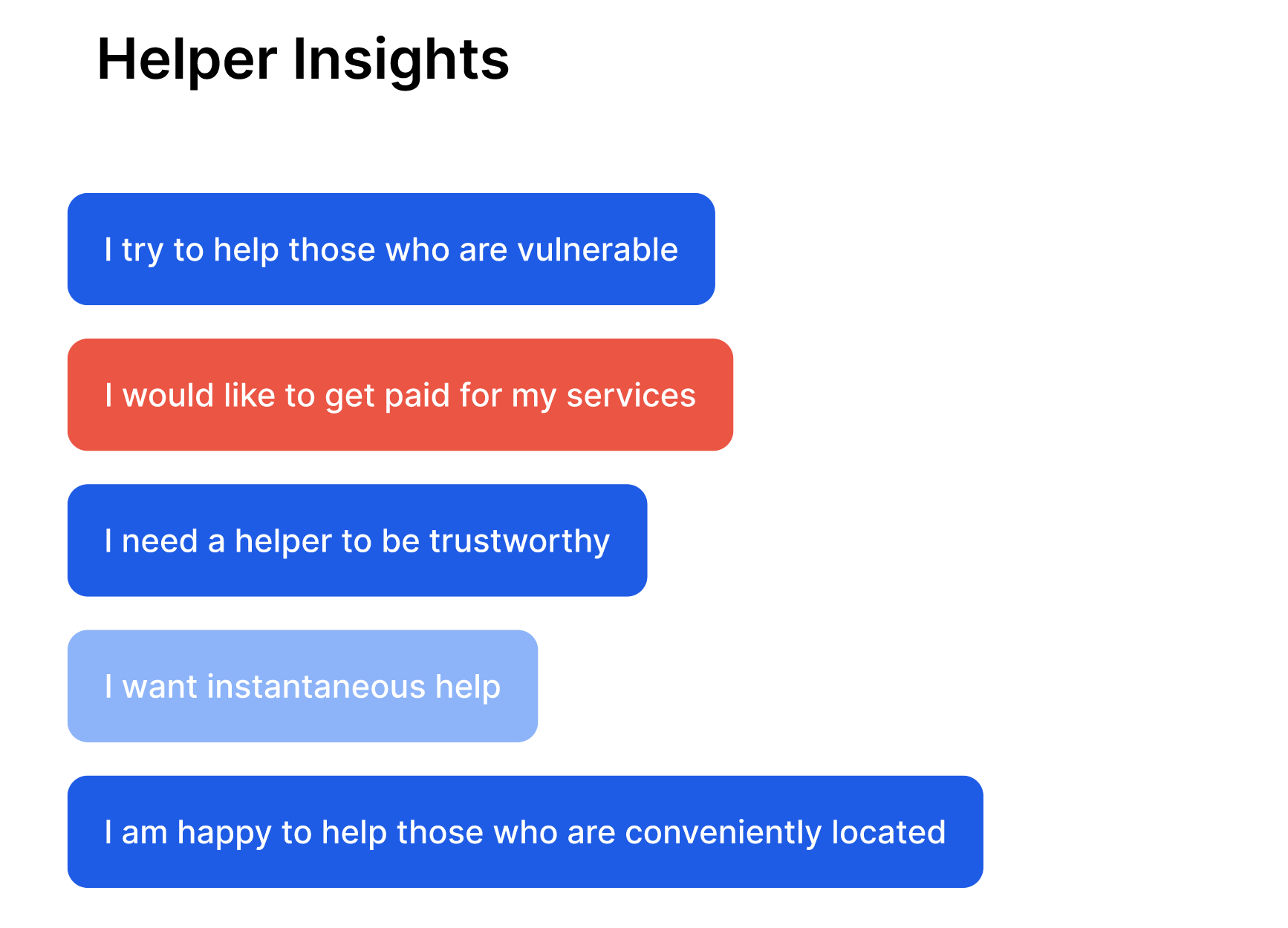
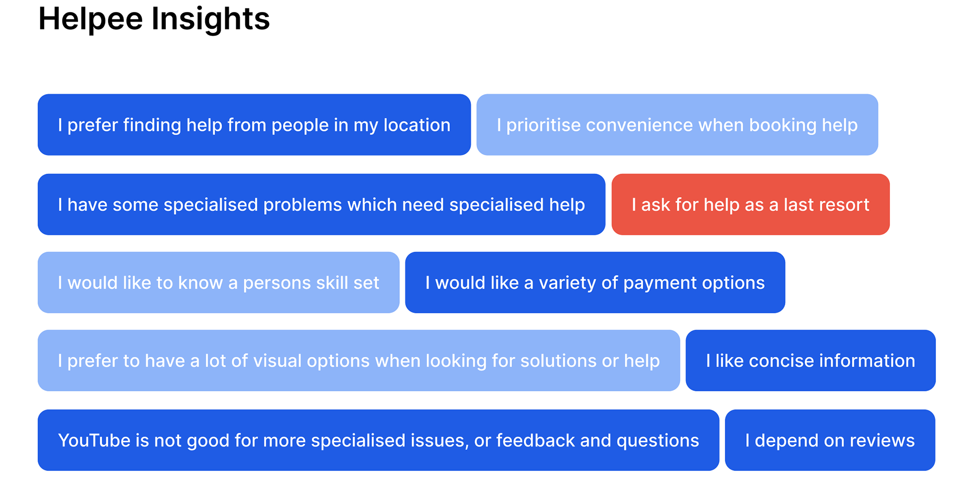
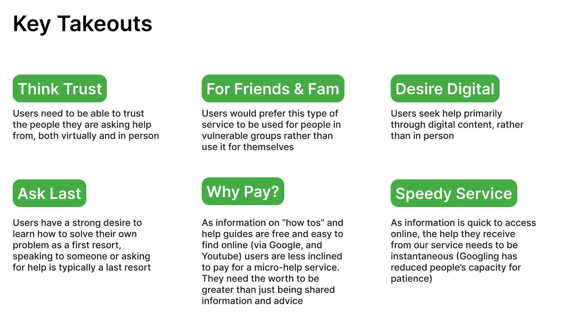
The key takeaways from conducting these interviews was that we learned that most users had fears of not getting timely help, trust involved with the person who was helping and the worry of the service being monetised.
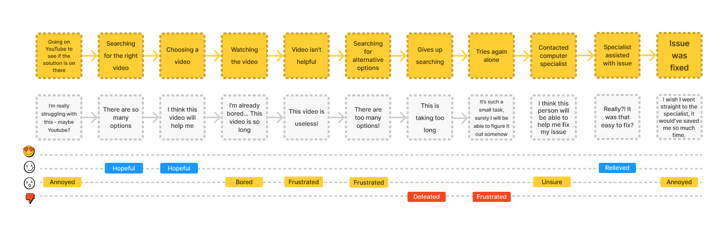
User Journey:
Once we had completed our interviews, we created two user journeys: one from the point of view of the Helper and one from the Helpee. We focused on this journey of the User trying to solve a problem by going online and trying to fix a solution themselves and then going forward and asks for help.
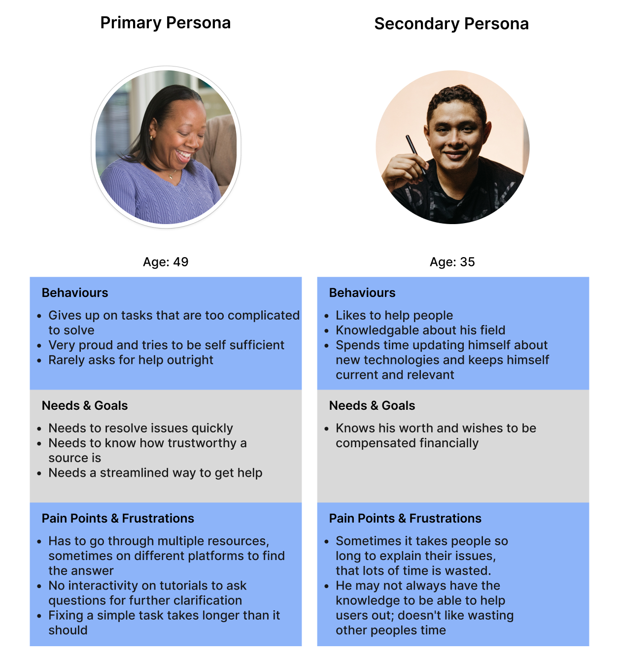
Persona:
We felt that two different personas were needed to display the needs of both the ‘helper’, and the ‘helpee’. The two users have different goals and frustrations, however, the one common frustration they have is that both do not want to spend very long on tasks.
We focused on Dara as our primary persona. She was the helpee persona and the one we decided to focus our designs for.
Problem Statement:
We had a brainstorming session to come up with a problem statement. This was a statement that covered Dara's main frustrations so that this could be addressed in the design we created for her.

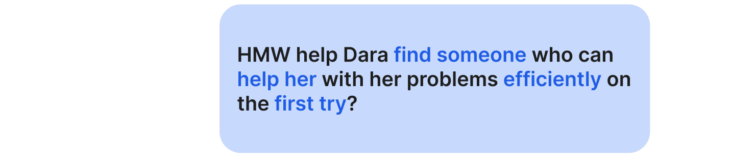
How Might We?
Once we had narrowed down on the problem statement, we had to decide How Might We help Dara and came up with questions that needed answering. Each of us came up with questions individually and them we brought all our ideas together to create one question that we focused on:
Design Studio:
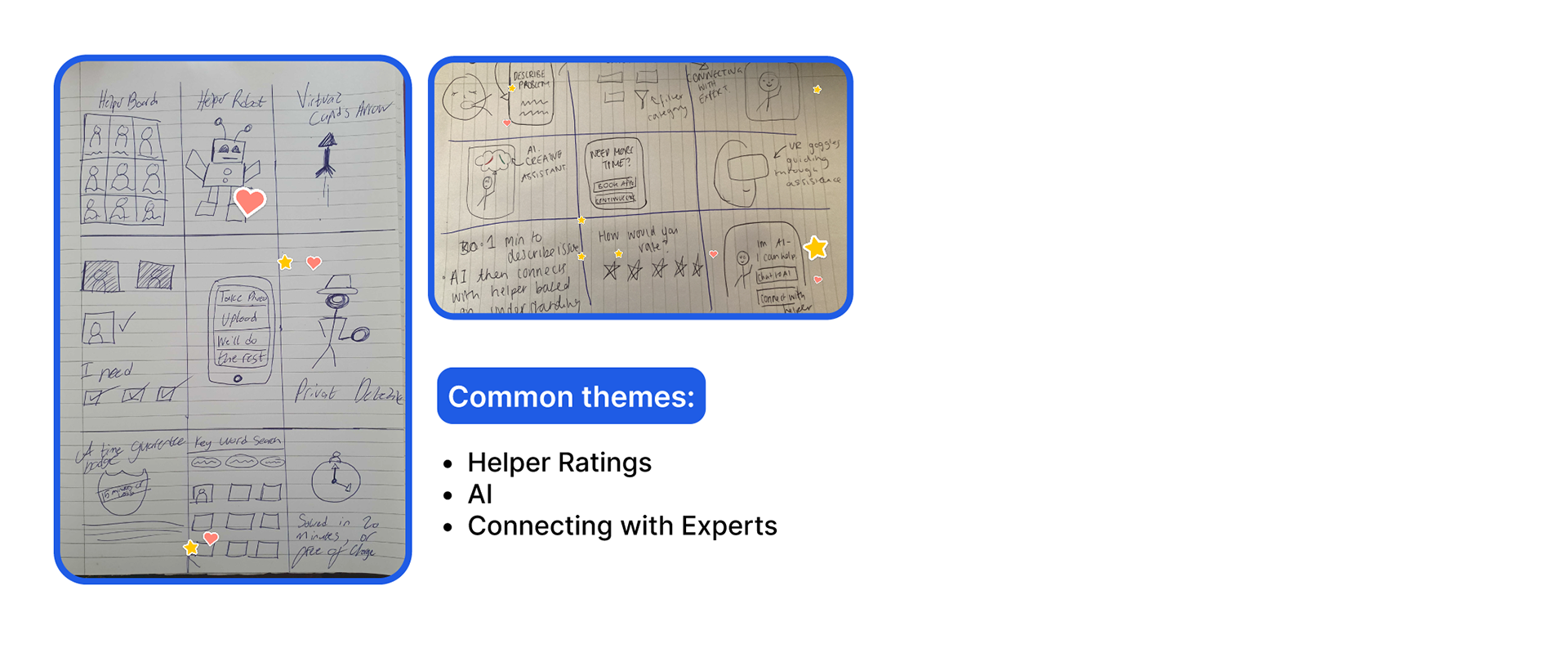
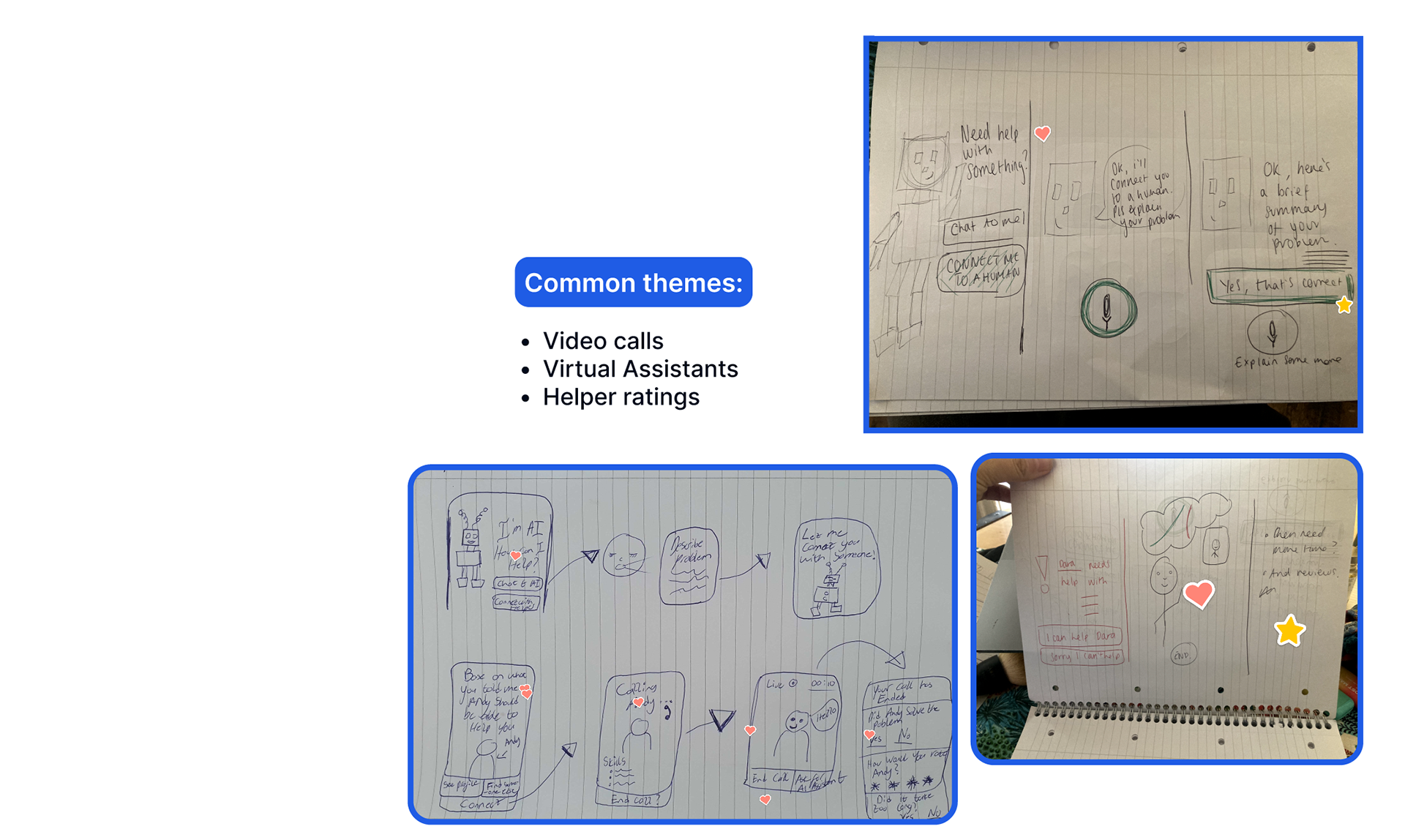
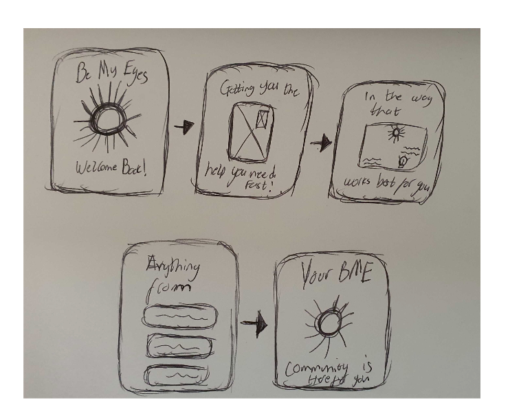
A design studio is an activity that we facilitated in the team to start the ideating of the design process. We took the "How Might We" and had 3 rounds of quick sketching of our answers in the crazy 8 format. The ideas didn't need to be well drawn out and at the end we refined our ideas using a voting system to move forward.
From this exercise we saw some common themes emerge in the form of sketches and we now had a way forward as a team. We decided to move forward creating a mobile app with an interactive chat feature, a feature to connect with a BME Volunteer and a feature to chat with an AI assistant,
Sketches to Screens:
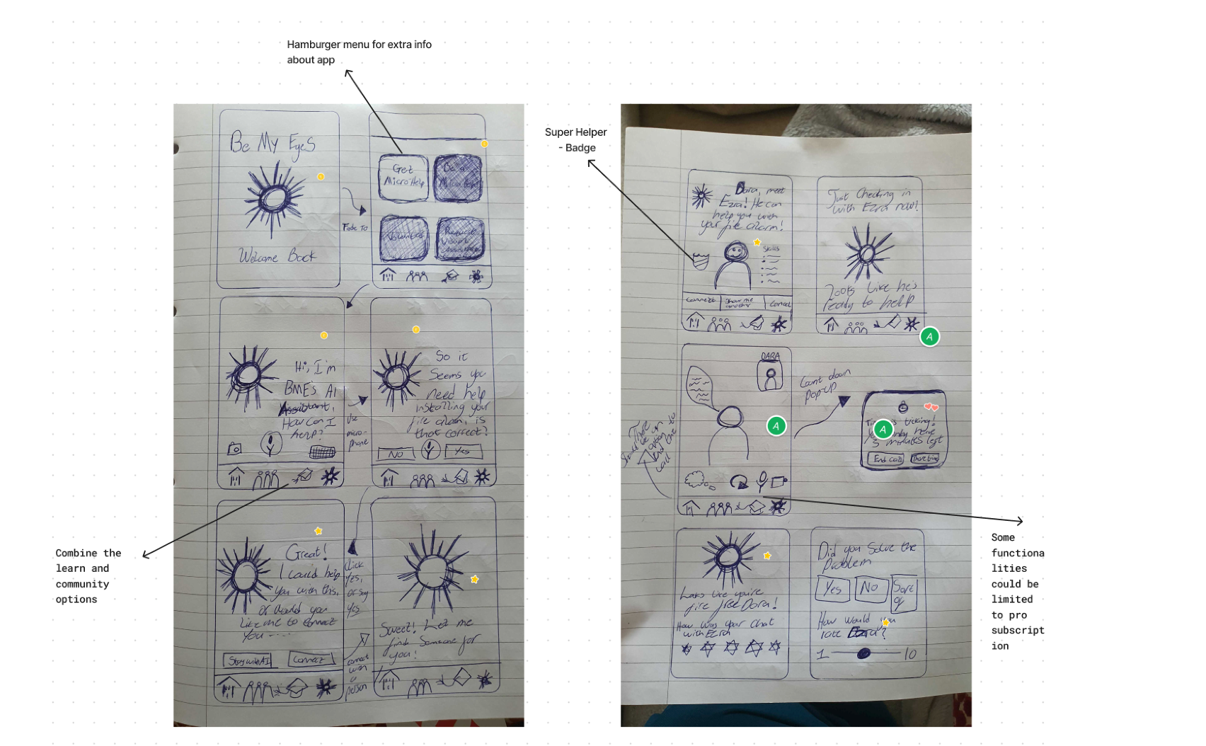
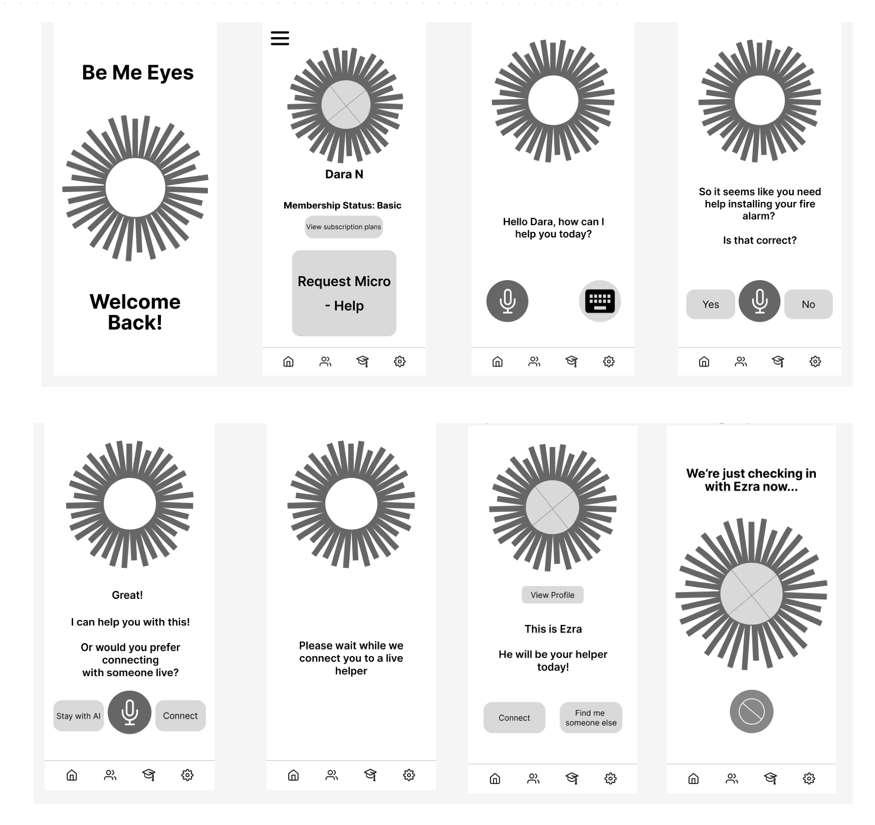
Once we had our sketches from the third round, we used those as a base to create our low fidelity wireframes. Our main goals had been aligned:
- Incorporating the BME logo as an AI representative
- Having a visual representation of the helper’s quality and experience
- Using an AI chat bot to reduce thinking for the user, to save them time on their helper search
- Accessing help from the main page
- Having a visual representation of the helper’s quality and experience
- Using an AI chat bot to reduce thinking for the user, to save them time on their helper search
- Accessing help from the main page
Usability Testing:
To test our wireframes, we decided to get some feed back from our mid fidelity wireframes before moving into High Fidelity. We wanted to make sure that what we are designing works and make changes that will help our users before moving forward into the UI aspect of the design.
For our first round of Usability testing, I used Maze and did unmoderated remote testing.To determine if the user flow is quick and easy to follow, and allows the users to successfully find help on the first try. I set 2 tasks for the users - one was to get help using the app and the other was to explore subscriptions. We got 8 responses and these were the iterations we made after Round #1 of testing:
Usability Testing - Round 2:
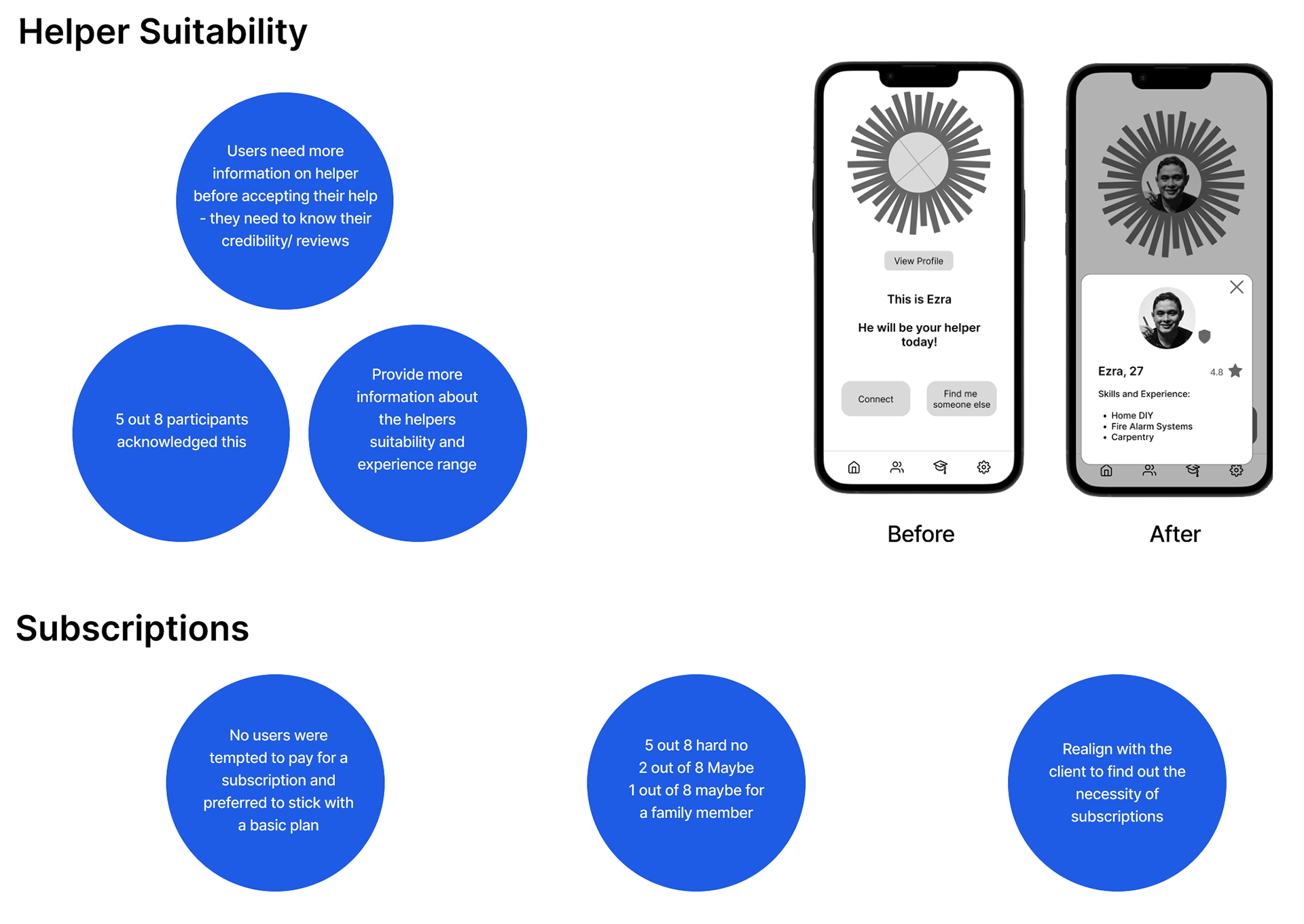
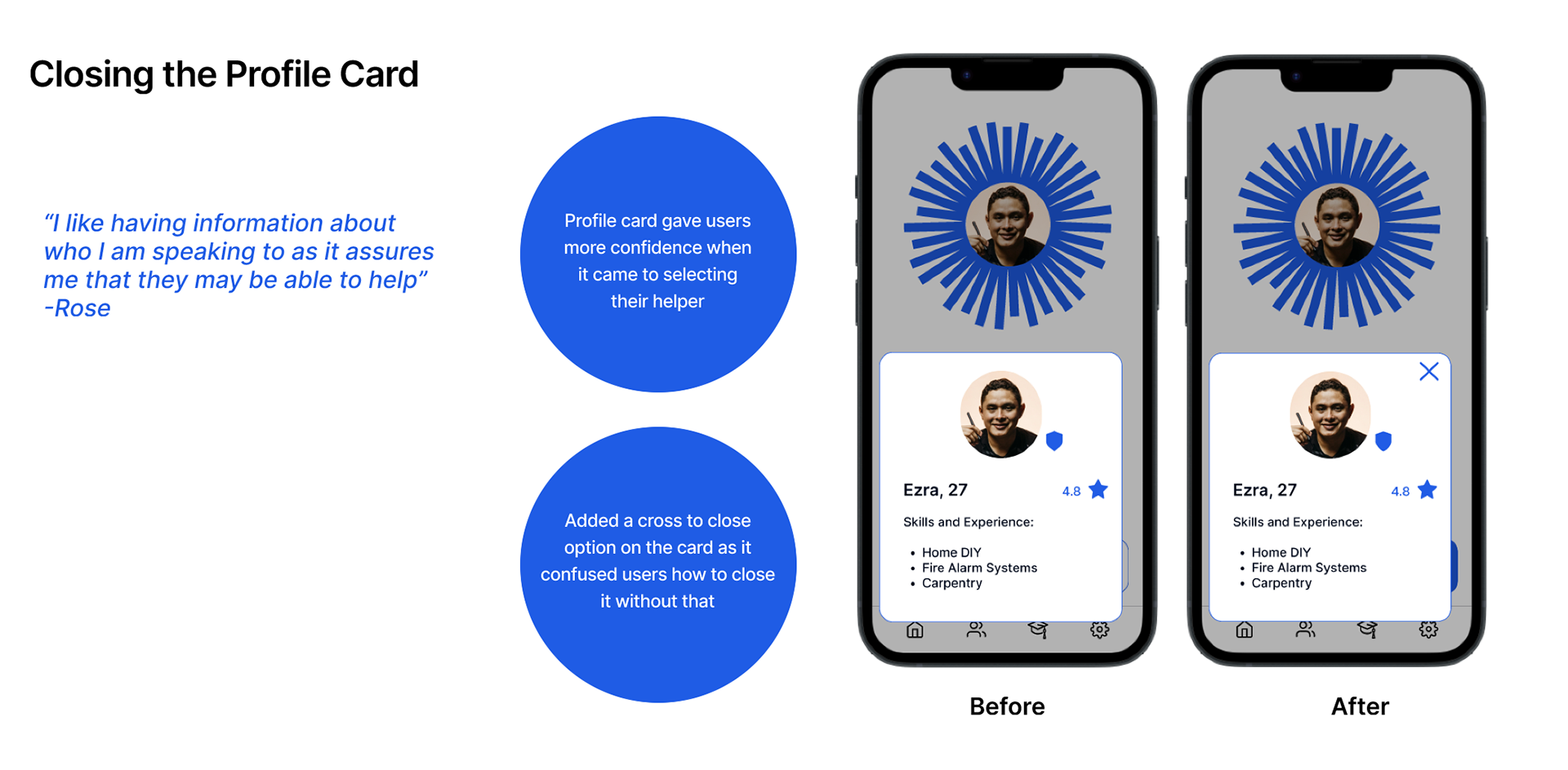
The purpose of this test was to determine if the detailed profiles gave users more confidence when selecting their helper. Additionally, due to the lack of uptake regarding the subscription plans, I wanted to discuss with users different incentive ideas that may persuade them to invest in a subscription. These were the iterations made in this round.
Usability Testing - Round 3:
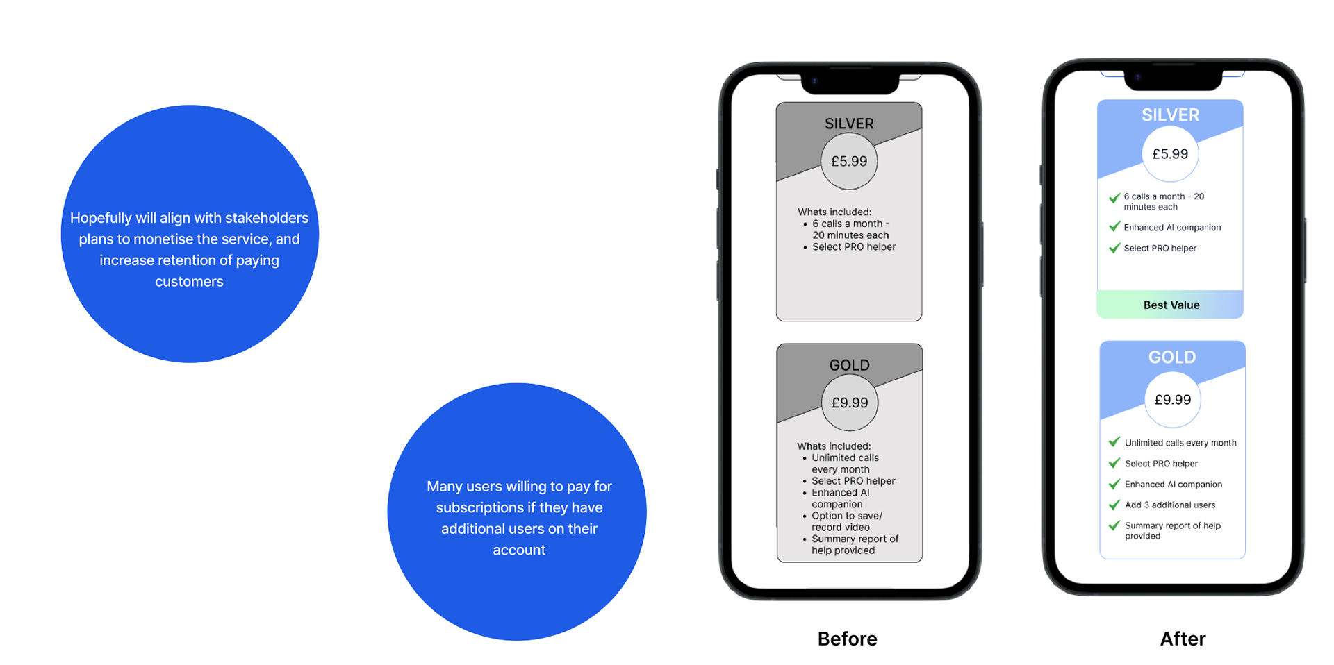
For the third round of testing the key considerations was linking back to our stakeholders goal of monetising the app. The purpose of this test was to determine if the iterated subscription packages encouraged users to invest. During further usability testing, I learnt that around half of users were willing to pay for a subscription if they have additional users on the account. This would solve the matter of monetising the product, and hopefully would increase retention on the app as I believe users would be incentivised to use the app more if it is a product that they are paying for. Framing the silver package as best value also encourages users to choose the monetised option rather than sticking with the basic plan.
Onboarding:
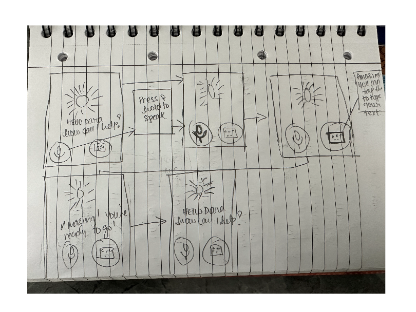
After completion of the high-fidelity UI we felt an onboarding process would be beneficial to fully understand the functions of the app. I wanted to create a benefits focused onboarding experience to really highlight to users why they should want to use BeMyEyes over pre-existing free services such as YouTube.
When considering our persona Dara’s needs and goals we can see how her main aims were for a quick and efficient service, so I made it a top priority to include this in the onboarding experience. I facilitated a small design studio to build screens for the onboarding process and I built a prototype that walked the user through the process of using the app and showing them how simple it really is.
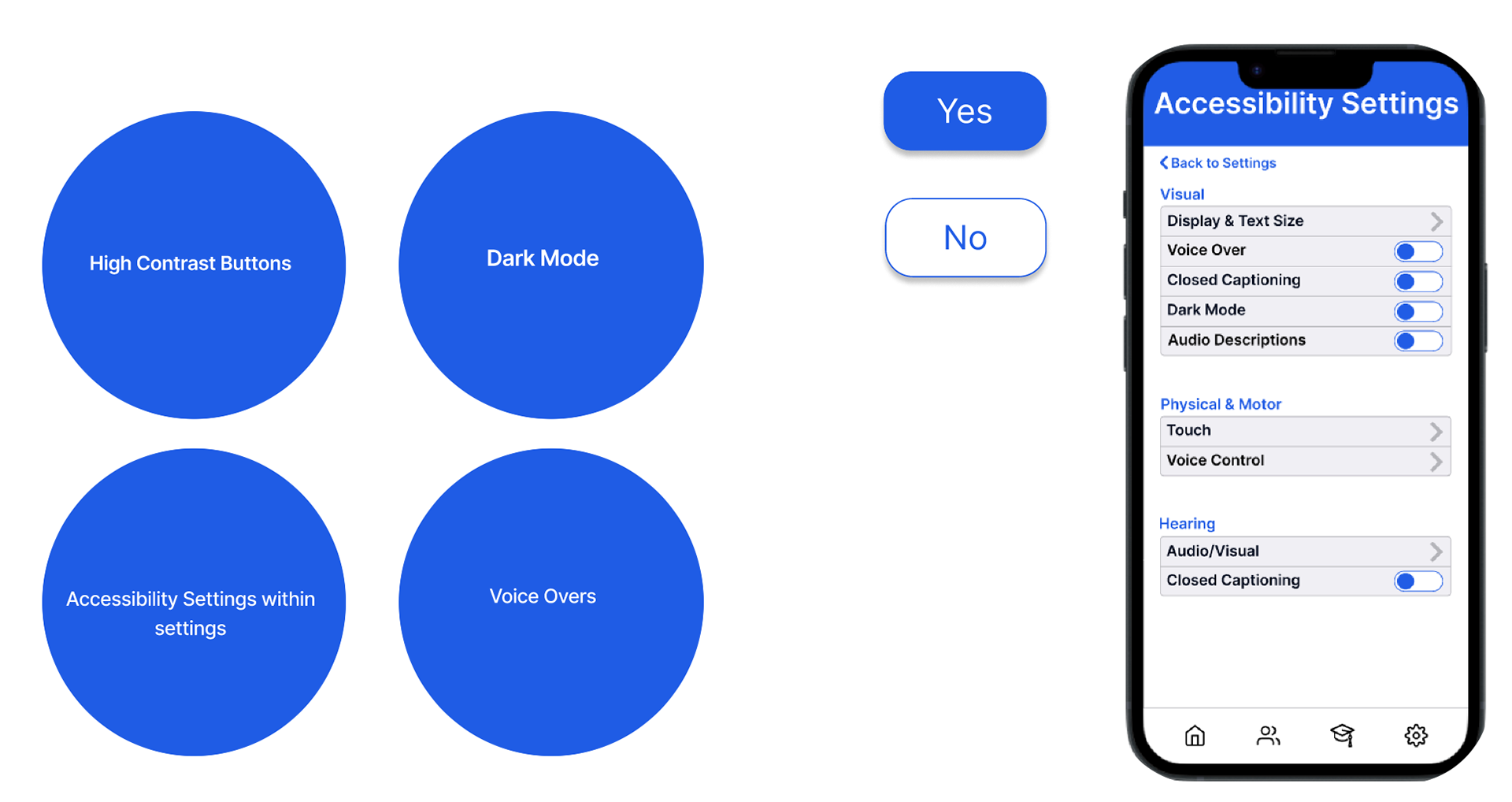
Accessibility:
When it comes to accessibility in the app, I decided to add an accessibility settings page where users can customise their preferences to what they need/prefer
I made buttons high contrast and quite big, consistent with the current Be My Eyes app to make it easy for everyone to read and tap on
There is an option for dark mode as well to increase contrast and the voice overs can also be muted, depending on user preferences. In our usability testing, muting the voice overs was feedback we received from testers and I implemented it hoping for them to have a better experience now.
Final Prototype:
You can view the final prototype here.
Next Steps:
- After testing, we think it might be better to narrow down the target market.
- Look further into testing more accessibility options, centralise the BeMy Eyes app services so that volunteers can also ask for help.
- Add voice over upgrades, maybe in different languages so that it is more inclusive to people from different cultures and even different countries.
- Introduce a reward program for micro helpers
Conclusion:
Working on this project was a very rewarding experience. I had a chance to work on accessibility features which was really interesting and is it something I want to learn more about and focus on.
Creating voiceovers on the prototype also got me thinking a lot about AI and the new technologies in the market. After this project, I read that Be My Eyes also introduced an AI option on their app and it was really interesting to read about that as well.
Teamwork, communication and time management were the key principles that we improved on while working on this project. I learnt from every interaction that was created, both while designing or while working with my wonderful team!